Sunday, April 24, 2022

Fun with words: Portland Trail Blazers

I've been an editor for my entire professional career. As such, I'm always learning about the English language. Sometimes it's a "shop talk" thing, like finding some new information in a style guide about the way to properly use a hyphen or en dash. Other times it's more entertaining, like discovering the etymology of a word or the origins of a particular idiom or colloquialism.

Recently on a website called grammarist.com, I came across one of these origin stories that made me immediately think of a sports team (and therefore trading cards).

The idiom is "blaze a trail".

Are you thinking what I was thinking?


Yep, the Portland Trail Blazers. 
 
The logo above is the one that was used from the team's inception in 1970 all the way through 1990. I like it a lot.

But back to the phrase in discussion here:

I was familiar with the idiomatic meaning of "blaze a trail": To be the first person to do something, to be the maverick who does something in a new way that others will no doubt follow.

But what I didn't know was that there's a literal meaning as well. (It has nothing to do with fire.)

Here's what the article from Grammarist says:
 
"The expression blaze a trail can also be used literally to mean to mark a trail by cutting notches in trees, tying flags to branches, etc. The idea is that one is making a new path for others to follow.”
 
And with all the forest land in Oregon, you can see just how fitting the team name "Trail Blazers" really is. Nice work there.
 
Because this is a trading card blog, I thought I should feature a card or two featuring some well-known Blazers. However, I don't collect basketball cards, and I don't think I've watched a basketball game since the 1990s.

But there are some great-looking vintage basketball designs out there, so I decided to browse around and perhaps purchase a card for my collection.
 
Here's one that I'm thinking about:


1975-76 Topps #165, Geoff Petrie


I like the diagonal neon stripes at the top right, as well as the font choice for the word "Blazers". More importantly, you get a full-length shot of a player on the court during game action, dribbling a basketball, wearing those classic tube socks. You also get a good look at the "Portland" text on the front of the jersey.

On top of that, Geoff Petrie was a very good player. He was the first-ever draft pick of the Trail Blazers, and was named rookie of the year in 1970-71. A knee injury limited his career to just six seasons, but he was an all-star twice in that time.

And here's an interesting tidbit: It seems like Petrie was the first NBA player to switch from the long-standing and popular Converse brand of sneakers to a sponsorship with a relative newcomer called Nike. Pretty cool piece of history there, as the Nike company was founded in Oregon.
 
So there's a little fun with words.
 
Any other suggestions for a vintage Trail Blazers card to pick up for my collection? Share the year, player, and card number in the comment section, and thanks for reading!

Sunday, April 17, 2022

A Commissioned Custom Card (and a Giveaway)

Since I began printing out my custom card designs last year, I've received a few emails from collectors asking if I'd consider designing and printing a custom card just for them. It's a flattering experience, and most of the time I've taken on the project, even if the subject matter isn't super-exciting to me personally.
 
I haven't mentioned these commissions here on the blog to this point, but recently I completed a project that I was especially pleased with.
 
The client asked if I'd create a card of Nancy Wilson, guitarist and vocalist from the rock band Heart, and suggested the 1967 Topps design. That worked for me, as I'd already created a 1967 Topps template when I worked on the El Mariachi and Carolina project, so I set out to find a photo of Nancy Wilson that was just right.

It didn't take long to find one, and I whipped up the card front pretty quickly.


As for the back, the client asked if I'd consider creating one that resembled the original '67s, which included two cartoons along with the standard batting record. I said I'd give it a try. After some thought and research, I found two cartoons from the original set that worked pretty well for a rock band, modified the accompanying text, and figured out a substitute for the batting stat section.


I like how the stats on the back turned out. Not only do they offer collectors a good look at Heart's discography and greatest hits, but they also provide a similar enough look to the stat lines that appear on a standard baseball card.
 
In fact, I was so happy with the result that I thought it would only be right to create a card for Nancy's sister, Ann, who is the lead singer in the band.


And here's Ann's card back. I used two different cartoons, and also created a separate write-up and stats.


Once I finished both designs, I sent the proofs out to the client. He enjoyed the finished product just as much as I did, and gladly purchased a few for his collection, which made me very happy. 
 
But that's not the end of the story. Recently he sent me an email to let me know that he did something special with a couple of the cards. Have a look at what he posted on his social media account:


He sent off the cards for autographs!
 
As far as I know, this is the first time one of my custom cards has been autographed by the person featured on the front. It's pretty cool to think that the legendary Ann and Nancy Wilson actually held my cards in their hands and signed them. Hopefully they enjoyed the designs.
 
But that's still not the end of the story. I've got some extra copies of these cards, so as usual, I'm going to offer up a few here as a little giveaway.
 
Just be one of the first three readers to list your favorite Heart song in the comment section, and I'll send you a copy of both cards. (Not autographed, of course.)
 
If you're one of the claimants and I don't already have your mailing address from a previous giveaway, here's how to reach me:
 
My email address is available on my blogger profile page

You can also message me on TCDB.
  
Even if you miss out on the giveaway, let everyone know in the comment section if you're a fan of the band, and if you've got a favorite song or two.
 
I look forward to your answers!


Sunday, April 10, 2022

Completed Set: 1977-78 Topps Glossy Hockey Inserts (rounded edges)

A couple of years ago, I finished the 1977-78 Topps Hockey base set. It was, and still is, the oldest hockey set I've completed. And although at the time I was aware of a small insert set that went along with the base set, I didn't pay it much attention. After all, I was still busy celebrating the main set completion. 
 
However, time has since gone by, and I've been looking for another set to complete. Not really up for a big set build, I've been going back to some of the sets I've already completed to see if there's anything else I can add to them. For example, wax box bottoms, instant win cards, stickers, and the like.
 
So, I looked into the glossy inserts for this '77-78 set. There are only 22 cards in total, which I thought was very doable. And back when these cards were available as wax packs in local drug stores and supermarkets and the like, one glossy came in each pack. I figured it would only be right to find all 22 and add them to the 1977-78 binder. 
 
With a combination of trades on TCDB and a few little purchases on sportlots.com, the set was complete. Here are all 22 cards, in number order.


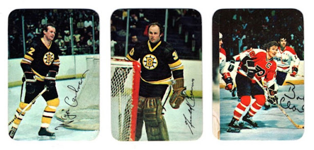
First up we have Wayne Cashman on the prowl behind the net, Gerry Cheevers sporting those classic leather pads, and a miscut Bobby Clarke. (Maybe I'll replace that one someday.)


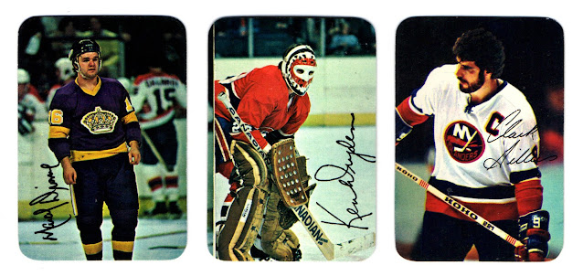
Next it's Marcel Dionne, who's possibly heading to the penalty box after a scrap, Ken Dryden with a super-cool, classic paint job on the mask, and Jethro (a.k.a. Clark Gillies) lookin' tough.


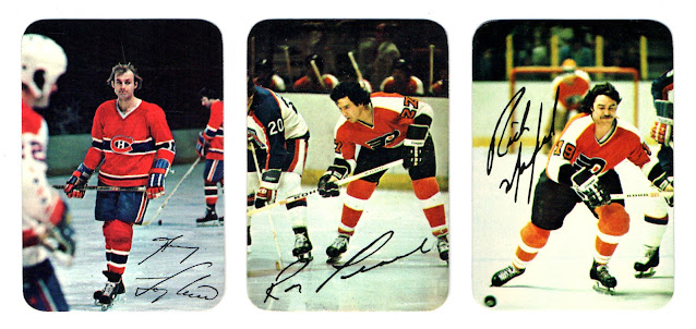
Guy Lafleur is captured in a moment of stillness, soon to be going 30 mph no doubt, Reggie Leach is giving a little stick chop to a Rangers player on the face-off, and Rick MacLeish is chasing after a loose puck. Looks like he's going to get there first.


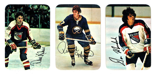
Now it's Dave Maloney playing some defense, Rick Martin on the offensive, and Don Murdoch with some nice hockey hair. It seems like most players made a deliberate effort to sign their names in whatever open white space existed on the photo, which is really nice.


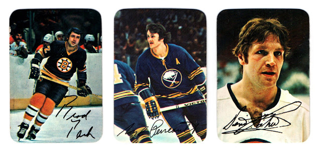
Here's Brad Park coasting around as some Captials look on from the bench, Gilbert Perreault showing us that classic Sabres logo, and Denis Potvin, who has likely either just thrown a body check, or is looking to throw one. If you've noticed by now that these cards go in alphabetical order by the player's last name, give yourself a bonus point.


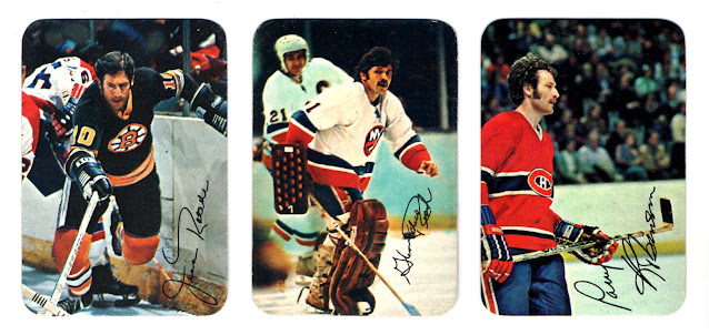
Next we have Jean Ratelle battling along the boards, Glenn Resch loosening up in pre-game warmups, and Larry Robinson skating into the frame to assess the scene in front of him. These cards measure 2 1/4 by 3 1/4, so they're a little smaller than standard. The cardstock is a little different too, and card fronts have a slight gloss. Another interesting point is that these cards were issued with square corners, too. (Same players, same order.) I'm not sure about the distribution rates, or if that was a regional thing, but the square-cornered versions appear to be more scarce.


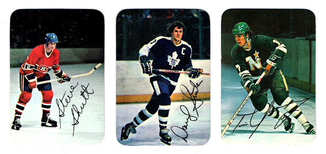
Steve Shutt positions himself for a one-timer while Darryl Sittler shows us his nimble crossover step. Meanwhile, Tim Young darts toward the goal from the left wing. Shutt had a monster year, with 60 goals. As for Tim Young, this was only his second season in the league, but he had a career year with 29 goals, 66 assists (T-3rd in NHL), and 95 points (T-5th in NHL).
 
I actually went slightly out of order with those three cards, however (19, 20, and 22), in order to leave card 21 on its own. 
 
Why?


It's a horizontal card! There's Rogie Vachon, ready to make a save. What a terrific photo.

Now here are some card backs.


Not much to talk about there. But there are some talking points about this set.

For instance, as I was putting it together, I wondered how the players were selected. Did they represent the all-star selections from the previous year? Well, most of the all-stars were included, but not all. Borje Salming and Guy Lapointe are missing.
 
So, how were the players chosen? I investigated a bit further:

The set consists of 13 players from the Wales Conference and 9 players from the Campbell Conference, so Topps didn't use that factor as a guide. 
 
The set consists of 4 goalies, 4 defensemen, 7 centers, 4 left wings, and 3 right wings, so Topps didn't quite use that factor as a guide, either.
 
There were 18 teams in the NHL at that time, and only 9 are represented in this insert set:

4 Boston Bruins
4 Montreal Canadiens
3 Philadelphia Flyers
3 New York Islanders
2 Los Angeles Kings
2 New York Rangers
2 Buffalo Sabres
1 Toronto Maple Leafs
1 Minnesota North Stars
 
Strike that factor from the equation, as well. 
 
So what is it? Well, the choices seem to be based on the points leaders from the previous season. But even so, Topps left out players that could have very well been included, like Lanny McDonald (5th in goals, T-8th in points), Borje Salming (T-3 in assists), Wilf Paiement (6th in goals), Peter McNab (T-8th in goals, T-11th in points), Phil Esposito (13th in goals, T-17th in points), and Butch Goring (T-10 in assists, 12th in points).

So why not swap in a few of those guys for Boston's Wayne Cashman, or the Rangers' Dave Maloney or Don Murdoch, who didn't show up near the top of the scoring leaderboards? It would have been fun to see the wider variety of uniforms that Wilf Paiement of the Rockies, Dennis Maruk of the Barons, or Guy Charron of the Capitals would have brought to the set, for example.
 
Regardless, it's still a nice little set, and I'm happy to have completed it and added it to my '77-78 binder.


And that leads to a question for you readers: 
 
When you complete a base set, do you then go for insert sets like this one? 
 
And if you already have the base set in a binder, do you add the insert set at the end? Or maybe the beginning? I add mine at the end of the binder.

Share in the comment section, and thanks for reading!

Sunday, April 3, 2022

From the Favorites Box: Theodore Roosevelt, 1952 Topps Look 'N See #6

A series where I post some thoughts about favorite cards. Previous cards in the series are available here.
 
The man featured on today's card is an absolute legend in my book. Many of you likely know a thing or two about him—if not from what you may have learned in school, then from numerous books and television documentaries about him. (The PBS series about some of the key members of the family is worth a watch.)
 
And as card collectors and sports fans, you might also know this man from a portion of a certain speech he gave that's been quoted by a few athletes over time, none bigger than Tom Brady.
 
The full speech is titled "Citizenship in a Republic", and the entire thing is powerful. I'll add a quote here from the specific portion that's so popular with athletes. After reading it, I think you'll see why.
 
"It is not the critic who counts; not the man who points out how the strong man stumbles, or where the doer of deeds could have done them better. The credit belongs to the man who is actually in the arena, whose face is marred by dust and sweat and blood; who strives valiantly; who errs, who comes short again and again, because there is no effort without error and shortcoming; but who does actually strive to do the deeds; who knows great enthusiasms, the great devotions; who spends himself in a worthy cause; who at the best knows in the end the triumph of high achievement, and who at the worst, if he fails, at least fails while daring greatly, so that his place shall never be with those cold and timid souls who neither know victory nor defeat."
 
Softball season just started over here, and I know I'm ready to slug some hits and get dirty in the field.

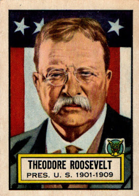
No more beating around the bush, though. Here's the man himself, on cardboard.


This Theodore Roosevelt card is one of the bigger hitters in the 1952 Look 'N See set, but you know what? I'd hardly purchased any cards for my collection in 2021, and I definitely wanted a copy of this one, so I found a decent deal online and went for it.

What pushed me to the point of purchase, however, was not anything I've mentioned above. It was a result of reading a book that Roosevelt wrote a few years after his second term in office called Through the Brazilian Wilderness.
 
Accepting an invitation from some highly regarded Brazilian leaders and naturalists, Roosevelt and his son Kermit would travel to the country and help chart some of its unexplored areas on foot and by dugout canoe, cataloguing some never-before-seen animal, insect, and plant species along the way.

It was a monumental task. The team would have to venture down uncharted rivers (including one called "The River of Doubt"), fend off snakes and swarms of insects, endure poor weather, rapids, near starvation, injury, sickness, the whole nine yards. And Roosevelt was in his mid-50s by then. 
 
But his vigor remained. Just read this statement from the man regarding the journey he and his American-Brazilian team completed. It's one of my favorites in the entire book.

No man has any business to go on such a trip as ours unless he will refuse to jeopardize the welfare of his associates by any delay caused by a weakness or ailment of his. It is his duty to go forward, if necessary on all fours, until he drops.

And there were times in the journey when they really were pushed that far. Here's another excerpt:
 
Kermit's experience in bridge building was invaluable in enabling him to do the rope work by which alone it was possible to get the canoes down the canyon. He and Lyra had now been in the water for days. Their clothes were never dry. Their shoes were rotten. The bruises on their feet and legs had become sores. On their bodies some of the insect bites had become festering wounds, as indeed was the case with all of us. Poisonous ants, biting flies, ticks, wasps, bees were a perpetual torment. However, no one had yet been bitten by a venomous serpent, a scorpion, or a centiped, although we had killed all of the three within camp limits.
 
I think people were indeed tougher back then.
 
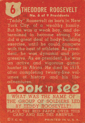
But let's get back to the card now. Here's the text and design on the reverse:


I might be a little partial because Mr. Roosevelt is such an icon to me, but the motivation I receive from reading about him seems almost limitless. Here's one more quote from "Citizenship in a Republic".
 
To say that the thriftless, the lazy, the vicious, the incapable, ought to have the reward given to those who are far-sighted, capable, and upright, is to say what is not true and can not be true. Let us try to level up, but let us beware of the evil of levelling down. If a man stumbles, it is a good thing to help him to his feet. Every one of us needs a helping hand now and then. But if a man lies down, it is a waste of time to try to carry him; and it is a very bad thing for every one if we make men feel that the same reward will come to those who shirk their work and to those who do it.
 
Strong points for the world in which we currently live.
 
Now it's time to decode the card back. The text box at the bottom of the card asks, "What was the name of the group of soldiers led by Teddy Roosevelt?"

Know the answer? 
 
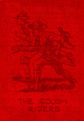
Okay, time to place my digital red cellophane paper atop the card.


The Rough Riders. Bully for the whole unit. Bully for Colonel Roosevelt. Bully for all of you readers and collectors.

And for continuing to motivate us to get off our duffs and accomplish great things—more than 100 years now since he first spoke those words quoted above—1952 Topps Look 'N See #6 has a place in my box of favorites.