Sunday, June 30, 2024

Completed Set: 1983 Topps Baseball

When I shared my completed 1984 Topps baseball set here on the blog a couple of years ago, I mentioned that it was the very first set of cards I remember opening packs of and eagerly collecting. 
 
However, the first set of cards I have any memories of at all might be this one.


There's something about that circle graphic in the bottom corner and the contrasting lines of color surrounding it. They stir up some very early memories. In fact, even 40 years later, I still have this niggling notion that I had a few little stacks of 1983 Topps baseball cards (and 1982 Topps football?) in a shoebox back then—my very first stacks of cards ever. I also have a notion that somehow my mom or dad stashed that shoebox in their bedroom closet, up through a little hatchway in the ceiling that provided access to the interior of the roof. I was very young in 1983, and we moved out of that house just a few years later, so that mysterious box became an afterthought rather quickly. But I wonder if it actually ever was in that little crawl space. Maybe it still is.
 
Regardless, I never replaced those [unverified] '83 Topps cards at any point during my childhood collecting days. And that means for a long while, I didn't have many cards from this set at all in my collection.  
 
So I decided it was time to right that wrong.
 
Because looking back, it was such a fun era for young card collectors. Baseball card designs were bright and kid-friendly. This Week in Baseball was must-watch TV, giving us glimpses of the biggest stars from around the league. And other shows, like The Baseball Bunch, taught us about the fundamentals of the game.
 
You know what else taught us about the fundamentals of the game? 
 
The 1983 Topps baseball set, that's what! And I think it does it better than most sets of the decade.
 
 
Here's what I mean:


Are you up at bat with a runner on first base? First thing you've got to do is loosen up and gain your focus with a couple of practice swings.


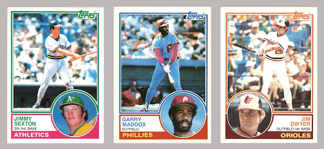
Now you're ready. But forget about swinging for the fences all the time. It's 1983. Just slap that ball on the ground, through the big hole on the right side of the infield, and advance the runner to second base. If a hit-and-run play is on, he'll make it to third. You're looking at textbook form up there from Larry Herndon, Ellis Valentine, and Pete Rose. 


Not confident with your hitting at the moment? No problem. Just bunt the guy over to second!


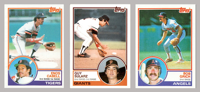
As for good defense? 1983 Topps had you covered. Enos Cabell and Guy Sularz both show solid technique, staying low and fielding the ball in front of them, with the right hand ready to trap that ball in the glove. And on the right, look at four-time Gold Glover Bobby Grich on his toes, ready to move in any direction for those hard-hit grounders and line drives.


Topps also reminded us that even though catching a pop-up isn't the most glamorous thing in baseball, every out is important. Every. out.


You know what else is important? Pitching. Look at the balance exhibited by these pitchers during their wind-ups. Work on that technique, young pitchers out there. And trust the fielders behind you.


But hey, for all of the small-ball and fundamentals, Topps also included images that showed hitters taking big cuts, of course.


There were some power pitchers, too, lookin' mean.


Speaking of mean, check out Mike Armstrong on the left. He's looking mean in the main photo and even meaner in the headshot! As for a couple of other photos I found interesting, there's legend Carl Yastrzemski in the middle, giving his fielders some practice, while George Brett on the right demonstrates how players celebrated a home run back then. Simple handshake. Amen.


And we can't forget about the three big rookies: Tony Gwynn, Wade Boggs, and Ryne Sandberg. Add in Willie McGee and Frank Viola, and I think only 1985 Topps competes with them for best rookie group of the decade. (Roger Clemens, Kirby Puckett, Mark McGwire, Dwight Gooden, Eric Davis, Orel Hershiser.)


Now let's talk about the design. 
 
Topps hadn't put a photo insert on the front of their cards since 1963. The new generation of card-collecting kids must have really gotten a kick out of it. Aside from that feature, I do like the way the two-toned borders separate the image on top from the text on the bottom. 
 
As for the color combinations, they're interesting, if not a little abstract. I like the light blue and purple on the Royals cards, for instance. The green and magenta for the A's is a trip, for sure. The Mets received a somewhat disappointing blue and red, while The Indians were given a wacky purple and orange. Overall, we get lots of fun '80s colors. (Plus some holdover oranges and yellows from the late-70s.)
 
It's a really solid look—so much so that Topps would borrow from it just a year or so later for their 1984-85 hockey set!
 
 
Now here's a card back


Black text on a light orange background. That ranks pretty high on the legibility meter. If there was room underneath the stats, like on Lloyd Moseby's card, Topps added some of the player's highlights from the previous season. There are no cartoons, which is usually a minus with me, but this time I don't mind it quite as much. I like how the hitter silhouette at top left and pitcher silhouette at bottom right help anchor everything.
 
 
Back to the set now. Subsets, to be more specific.


The Super Veterans subset was a whopping 35 cards deep, and featured players who'd been in the league for at least 10 years or so. (Gaylord Perry was the super-est Super Vet, with 24 years of service!) 
 
Card backs include some milestone dates, seasonal bests, and highlights for the player featured on the front. Each Super Veteran card was numbered so it would appear right after the player's base card in the set, which is fine. However, I kind of wish Topps would have run the 35 cards consecutively. It might have been cool to see 4 straight pages of these guys in a binder.


Team Leaders cards were done well, featuring the team's batting average and ERA leader on the front, and a team checklist on the back. 


The League Leader cards in this set could have been better. It's a pretty small 8-card subset, toward the end of the binder. The overall design is a little plain.


Like a few other Topps sets of the 1980s, the record breakers were in the lead-off spot. (The 1983 set had six record breaker cards in total.) Players selected for the 1982 All-Star Game received a separate all-star card. I like the big, bold star design in the corner. As for the manager cards, they were cool, because they listed the manager's playing stats on the back (if they were MLB players) as well as their managerial stats.


Topps put out some bright checklists throughout the decade, but this set must have some of the brightest ones.


And finally, a winning line-up game piece, one per wax pack.


So that's 1983 Topps baseball. I'm very happy to have completed this well-designed, well-regarded set. The cards are already in a binder, and I'm going to have to remember to take it off the shelf and flip through the pages every so often—maybe before softball games—to remind me of the fundamentals.
 
So where does the 1983 Topps set rank among all the sets of the decade for you? Do you have any favorite cards from the set?

Share in the comment section, and thanks for reading!

Sunday, June 23, 2024

The Old Norris Division, in Sticker Form

Back in the late 1980s, the NHL's conferences and divisions were named differently than they are today. You had the Clarence Campbell Conference (i.e., today's Western Conference), which was separated into the Smythe and Norris Divisions. Then you had the Prince of Wales Conference (i.e., today's Eastern Conference), which was separated into the Patrick and Adams Divisions. All those names refer to men who made early contributions to the league. It was just one way that young hockey fans like me could learn about the history of the game. It also made for some great-looking 1980s all-star uniforms.


Another interesting thing about the NHL back then is that there were only 21 teams in the league, believe it or not. This means teams played each other a lot more during the season than nowadaysespecially if they were in the same division. And this created some big rivalries. 
 
In the Adams Division, you had Boston vs. Montreal. You also had Montreal vs. Quebec, which was serious.
 
In the Patrick Division, you had Islanders vs. Rangers, and Flyers vs. Penguins.

In the Smythe Division, you had the battle of Alberta (Calgary vs. Edmonton).

And in the Norris Division? Well, all five teamsthe Blackhawks, Red Wings, North Stars, Blues, and Maple Leafsjust beat up on each other. It was such a tough division that longtime football sportscaster Chris Berman still sometimes refers to NFL matchups that share the same geographical region as the NHL teams, like Vikings vs. Bears, as an "NFC Norris Division battle".

Why am I detailing all this information about a time in the NHL that's quite a ways in the rear-view mirror?
 
Well, recently Mark from the Chronicles of Fuji posted some flea market finds. And amongst his haul was this:


A sheet of 1980s puffy stickers from the old Norris Division!
 
Hockey fan that I am, I left a comment on that post to express how cool the stickers were, and guess what arrived in my mailbox not long after?
 
Yep. The very same sheet of stickers. Mark, you're a legend.
 
It turns out the company made stickers for all NHL divisions, as well as individual player stickers. There was even an album with designated spots to adhere each sticker! I'm tempted to open the wrapper of mine and stick some of those classic logos on an old hockey card binder, but I'm going to resist the urge. Maybe if I pick up some duplicates. (You can find some listed on ebay.)
 
And you know what else I've got to do? Be more like Mr. Fuji and send out some RAKs to fellow collectors. If you're reading this and we haven't sent some cards to each other in a while, feel free to leave a comment or send an email. I'd really like to get some good hobby mojo going.

Thanks again for the sweet RAK, Mark. And I've got something to send to you in return, so stay tuned.

Sunday, June 16, 2024

From the Favorites Box: Nolan Ryan, 1975 Topps #5

A series where I post some thoughts about favorite cards. Previous cards in the series are available here.


I like this highlight card for two reasons: 

(1) 300 strikeouts for three consecutive seasons? Holy cow. 
(2) The camera angle makes Nolan Ryan look 100 feet tall. 

Look behind him. There’s nothing but blue sky, because trees and houses simply don’t go that high. The only thing you can make out is the top of a light pole down there in the left corner. Ryan is wayyy taller. 

From here, you have to wonder if he's going to complete his pitching motion and fire a fastball under your chin, or if he'll just keep his fist in that glove, bring both hands down together, and give you a good old-fashioned pounding.
 
But let's get back to Nolan Ryan, the pitcher. Aside from his league-leading 367 strikeouts in 1974, how about some other stats from that season? Ryan led the majors in innings pitched (332.2), walks (202), batters faced (1,392), and strikeouts per 9 innings (9.9). Do the math, and that means he struck out every 3.79 batters he faced that year. He went 22-16 with 26 complete games, 3 shutouts, and a 2.89 ERA.

And get this: if it weren't for a string of injuries in 1975 that left him with only 186 Ks in 28 starts, Ryan could have put together six straight seasons of 300 strikeouts. Look here:
 
1972: 329 Ks
1973: 383 Ks
1974: 367 Ks
1975: 186 Ks
1976: 327 Ks
1977: 341 Ks
 
It's also worth noting that he led the entire majors in strikeouts all five of those years surrounding 1975.

No wonder he's 100 feet tall on that card.
 
And for defining pure dominance and intimidation with a single photo, 1975 Topps #5 has a spot in my box of favorite cards.

Sunday, June 9, 2024

Board Advertisements on Cards, Episode 6: Amtrak

Way back in 1978, the NHL allowed teams to start selling advertising space along the boards of their rinks. By the time I was a hockey card–collecting kid in the late 1980s, the trend had caught on. From snack foods to car manufacturers to banks to fast food restaurants, board advertisements really ran the gamut—and they still do.

This series will explore some of the advertisements that also managed to make their way onto hockey cards.
 
Previous entries are available here.


1991-92 O-Pee-Chee #201,
Wayne Gretzky Highlights


Here's Wayne Gretzky in that classic Los Angeles Kings uniform, sporting that silver Easton aluminum hockey stick. He's positioned along the boards, no doubt ready to receive a pass and set up yet another scoring opportunity.
 
The card commemorates Gretzky scoring his 2,000th NHL point. No one has done it since. (Jaromir Jagr is the closest, with 1,921.) The feat was accomplished against the Winnipeg Jets on October 28, 1990. However, the photo on the front of the card is not from that game. How can we tell?

Have a look just over Mr. Gretzky's right shoulder. I see a little piece of a New York Rangers jersey there, to the side of the mustachioed guy's face.

Additionally, have a look at the advertisement on the boards behind Mr. Gretzky.


It's for Amtrak. And I know for certain that an Amtrak advertisement was plastered on the boards at Madison Square Garden back then. You see, the Garden is right on top of Penn Station, which offers Amtrak train service to various parts of North America. (Winnipeg does not.)
 
I wonder if the folks at MSG were kind enough to cut them a deal on the advertising fee.
 
Even if they didn't, let's talk about Amtrak. 
 
In theory, it's great. Ride by rail. See the country, from the mountains to the prairies, etcetera. Enjoy our café car. And our bar car. And for the really long trips: our sleeper cars!
 
In practice, however, the experience can be less than ideal. Delays. More delays. Inadequate luggage space. Crowded cars. Inconsiderate passengers. (One time, the guy in the seat across the aisle from me immediately took off his shoes upon boarding, and stretched his bare, stinky feet out into the aisle.)
 
It's not all bad, of course. Sometimes Amtrak really does live up to its potential. The scenery as you look out the windows can be truly beautiful. And I've got some great memories of taking Amtrak from Penn Station to the Adirondacks in the summers as a young teenager, by myself, toting along a duffel bag and a guitar, to spend time with my family up there. Nothing else quite like it.
 
Speaking of nothing else quite like it, I'm not sure we need to mention much about Wayne Gretzky's hockey history in this post: the 61 NHL records that he still holds to this day, or the 4 Stanley Cup rings he owns, or the 18 All-Star games he appeared in, or the many times he suited up for Team Canada, or anything else. Instead, how about we link the guy to the board advertisement?
 
Here is a list of the four NHL cities Mr. Gretzky played for, along with just some of the Amtrak lines that run to and from each city. (I've included links that provide more information, for those of you who might fancy traveling by rail):

Edmonton: None

Everything else aside, you've got to admit that the folks at Amtrak have come up with some great names for their train lines. Who wouldn't want to take a ride on the California Zephyr, or the Missouri River Runner?


So how about you readers? Have you ever traveled by Amtrak or any other scenic railway? If so, what was your experience like?
 
Share in the comment section, and thanks for reading!

Sunday, June 2, 2024

A Cowboy Signed My Custom Card

 
When I'm writing down addresses on envelopes for custom cards that are going out, I usually don't pay much attention to the specific information. Once in a while I'll notice a town's name if it's wacky or interesting, or if a card is going to a state that I don't often send to, like Hawaii or Nebraska or something, but that's about it.
 
However, a few months ago, I paused as I wrote a person's name on an envelope:
 
Burton Gilliam
 
This particular Mr. Gilliam had a mailing address in Texas. As for the card that was ordered? It was a few copies of this one. (Note the name of the actor on the bottom left.)


Could the cards be going to the very same Burton Gilliam who played the character of Lyle in Blazing Saddles? Excitedly, I looked at the transaction record and found the buyer's name.
 
Nope. It didn't match. 
 
However, I figured I'd contact the buyer anyhow, because hey, if these cards were actually going to Burton Gilliam the actor, I wanted to send my thanks—and maybe a few extra copies of the card.
 
Soon enough, an email reply came in...
 
The cards were, in fact, going to Mr. Gilliam the actor!
 
I turns out that the buyer was a good friend of Mr. Gilliam's, and wanted to send him a few copies. How cool.
 
But wait, that's not all. 
 
The buyer was more than kind, and he and I struck up an email conversation. And when I say "more than kind", I mean it. Soon enough, I learned that Mr. Gilliam liked the card so much that he wanted to autograph a copy for me!

It didn't take me long to respond. I sent a few more copies of the card along with a self-addressed stamped envelope, and within a couple of weeks, this beauty was in my possession.


Mr. Gilliam even sent back more than one signed copy.
 
But wait, that's still not all!

Mr. Gilliam is such a nice and personable guy that he sent me a video thank-you message as well! 
 
I won't show it here for the sake of privacy, but I'll tell you that he was even wearing a cowboy getup quite similar to the clothing and stetson he wore in Blazing Saddles. The video also made it clear to me that Mr. Gilliam is still going strong into his 80s. He seems young and spry and joyful—the embodiment of the philosophy that age is just a number.
 
What a cool guy.

A big thank-you to Burton Gilliam, and his good friend who made all this possible. The autographed cards will have a very good home in my box of favorite cards.