Sunday, February 25, 2024

Custom. . . Custom. . . Custom Card, Ho!!!

Watch this introduction:


All around, I think it was a fantastic effort from the creative team—animators, musicians, lyricists, writers, producers, you name it. I mean, tell me you don’t want to watch at least one episode of the show, just to see those ThunderCats battle the bad guys.
 
There's just one thing: The mid-1980s marked a golden age of animated shows, and the ThunderCats were up against some stiff competition. I only speak for myself, but the time I did spend watching cartoons back then was split more between The Transformers and G.I. Joe than anything else. (And that's not to mention other big action hits, like Voltron.) Those ThunderCats just didn’t manage to squeeze themselves into my TV time very much. 
 
However, they did have a cult following. And they still do. So a few months ago I decided to give them a fair shake by watching the first dozen or so episodes.
 
Here's what I'll say. Although it’s difficult for a show to live up to such a captivating introduction and theme song, I was definitely impressed by the creative storylines and various characters. If you were a kid who was into Lord of the Rings fantasy-type stuff back then, you'd have really been into this show.
 
I’d still rank it below some of those other notable franchises of the '80s, but I was inspired enough to create a custom card. After all, as far as I know, the original ThunderCats series didn’t receive an official trading card set like some of the other big hitters of the era. And with four main characters, a “team leaders” style of card was perfect. Here it is.


I used the 1974-75 Topps hockey card design as a base. You'll see that I added each character's occupation/skill underneath their name, which works out nicely in a "gaming card" sort of way. As for the larger design, my first idea was to replace the hockey stick that ran down the left side of the original card with the fabled Sword of Omens. However, the curved handle-guard of the sword took up too much real estate. It would have covered over part of Panthro, much of that terrific ThunderCats symbol, and some of the text to the right as well. So I went without it.
 
Besides, the Sword of Omens represents the good guys, and I couldn’t just make a card for them when there were four memorable villains to feature as well.


I went with the terrifyingly transformed musclebound monster version of Mumm-Ra, but his weak, decrepit mummy form would have been an equally terrifying choice. As for the mutant henchmen, all three of them made appearances right from the start of the series, so they're fitting entries for sure.
 
So that's that. Another two customs completed. I'm happy with the way the cards turned out, and I especially like the way they look together. I'm interested to see what kind of reception they receive.

Any ThunderCats fans out there? Favorite character?

Share in the comment section, and thanks for reading!
 

Sunday, February 18, 2024

Completed Set: 1990-91 Pro Set Hockey (Series I and Series II)


Pro Set. 
 
If you were a youngster who collected hockey cards in the early 1990s, seeing that brand name has likely brought back a tangled web of emotions. 
 
There was excitement back then, that's for sure. As a young hockey card collector, I clearly remember the brand's tagline: The Hottest Cards on Ice!

But were they? Yeesh. I don't know. That was kind of a bold claim for a company that was creating hockey cards for the first time—especially with Score, OPC Premier, Bowman, and Upper Deck all jumping into the mix that very same hockey season of 1990-91. And although Pro Set's inaugural release did generate some buzz at first, here's what I remember:
 
As collectors began opening packs from all those new hockey card brands, the buzz for Pro Set fell off. And with good reason.
 
First of all, it was riddled with errors (player name misspellings, wrong uniform numbers on the card fronts, incorrect stats on the card backs, wrong player photos altogether), and the photography sometimes left a lot to be desired. On top of that, the set didn't have foil wrappers and holograms like Upper Deck. It didn't have the exclusive rights to Eric Lindros like Score. It didn't have the history and strength of Topps and O-Pee-Chee. So who were they to claim they were the hottest cards on ice? Nobody, that's who.

But looking back, I'll say this: 
 
I appreciate Pro Set.

To use a baseball analogy, they were like the rookie who steps into the batter's box for his first Major League at-bat and swings as hard as he can on the very first pitch he sees, regardless of where it's located in the zone and what type of pitch it is. And I think there's something fun about that type of reckless abandon.

So for the rest of this blog post, I'm going to try to describe just how hard Pro Set swung at their first try with hockey cards. Whether you consider these points positives or negatives is up to you.
 
The set is huge 
Pro Set was released in two parts. Series I consisted of cards 1-405, while Series II went from card 406 to 705. That was an absurd number of hockey cards at the time. We'll get to how Pro Set filled all that space a little later. For now, here's the total number of cards in each of the major hockey releases of 1990-91:


I don't know which company finalized their numbers first, or if all the companies were privy to each other's information, but you'd have to think the folks at Pro Set were rubbing their palms together with a good feeling that they were going to churn out the most hockey cards that year.
 
 
The colors are huge
With all the new hockey sets that burst onto the scene in 1990-91, Pro Set had to do something to stand out. And they sure did. With color. Just have a look at these six action cards, for example. 


Those bold horizontal stripes, matched to each team's colors, really stand out. It's a good thing that the cards were numbered sequentially by team. Otherwise, there would have been way too many stripes of way too many colors on any given 9-pocket page.


The subsets are huge
So how did Pro Set increase their bulk? Subsets! In fact, there are more than 130 subset cards in all. Here are some examples.


There were all-stars, award winners, and team logos that sported a 3D metallic look—so cool in the early '90s.


There were career point leaders, Hall of Famers, and head coaches.


There were even 22 cards that featured referees!
 
For those of you who didn't watch hockey back then, I'll say that refs were pretty big stars in their own right. Kerry Fraser, Dan Marouelli, Pat Dapuzzo, Bill McCreary, Don Koharski, Paul Stewart, Andy van Hellemond. I remember names like that clearly. I don't think referees today get the same name placement and notoriety.


The amount of cards with errors and variations is huge


In fact, there's an error on the very first card of the set (pictured on the left). The name "Bourque" is misspelled "Borque" on the front.
 
Oof.
 
As for those other two, the photo on the middle card is not Peter Stastny. It's his teammate, Patrik Sundstrom. (Sundstrom's card features the image of Stastny.) The card on the right is not an error, but a variation. Look closely at Paul Gillis's face. He's got a bloody nose there. Pro Set spotted it early in production and airbrushed the blood out for the rest of the print run.


The number of rookie cards is huge
According to Trading Card Database, there are 213 rookie cards in the 705-card set. A whopping 147 of those rookie cards can be found in Series II. That means about half of Series II consists of rookie cards! Can't blame Pro Set there, as the rookie craze was well underway. And their approach paid dividends. There were some great rookies all around.


Series I has Alexander Mogilny, Jeremy Roenick, And Mike Modano.  


Series II has Sergei Fedorov, Mike Richter, and Jaromir Jagr, along with Ed Belfour, Curtis Joseph, Owen Nolan, Mats Sundin, and Peter Bondra, to name a few more. 


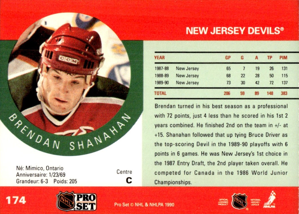
Now here's a card back


Pro Set did pretty well with the space here. The color bars and overall design continue from the card fronts. There's a player photo, some well-organized stats, and at least one paragraph of descriptive text. Unfortunately, a bunch of card backs contain statistical errors and other typos. And I think the team name at the top right could have been a little bigger or bolder. But overall, it's not bad.


Back to the card fronts, now.


Some of the stars of the era got good-looking cardboard.


Goalies got some nice treatment, as well. 
 
Overall, however, there were more misses than hits. Many cards feature players standing around during warmups or play stoppages. And there are quite a few blurry photos throughout the set, too—more than the other 1990-91 sets.


Getting back to some interesting aspects, on the left we've got a coupon card that was issued in every pack (10 cents off!). In the middle there's a peculiar "puck" card, which is the final card of the set. And on the right, the ultra-rare Stanley Cup hologram card that was randomly inserted into packs. As far as I know, the print run was limited to 5,000. That doesn't seem
at all scarce these days, but when you consider how many packs of Pro Set were churned out that year (millions?), the odds of pulling one of these holograms change dramatically. I sure don't own one. That photo is from the internet.
 
Interestingly, there are no checklists in this set. Just think that with some team checklists and general set checklists, the company could have bumped the totals up to 730!
 
 
In any case, that's 1990-91 Pro Set. With all its faults and foibles, it's still a landmark set of the era. I'm happy to have the whole, big, whopping thing completed. (I might even try to add a couple of the variations next, like the Stastny/Sundstrom cards featuring the correct player photos.)

If you opened packs of Pro Set back in the day, share some memories in the comment section. And if this is your first time seeing the cards in such detail, what do you think?

Sunday, February 11, 2024

From the Favorites Box: Kurt Bevacqua, 1979 Topps #44

A series where I post some thoughts about favorite cards. Previous cards in the series are available here.
 
 
Have a look at Kurt Bevacqua here, posing on a sunny spring afternoon.


I've always enjoyed posed shots like this, because they show the player with the tools of his trade. Like a carpenter posing with his tool belt. Or a blacksmith with an anvil, hammer, and leather apron. And Kurt Bevacqua sure had some tools. He was a utility guy. A hard-working guy. 
 
In other words, you don't see Bevacqua in the standard batting pose, gripping the bat and staring down an imaginary pitcher. He's not shown in action, taking a big cut at a pitch during a game. Instead, he's humbly kneeling on the field. You see his glove. His bat. His cleats. His cap. He's ready to go. Put him in anywhere, and he'll do his best to fulfill his responsibilities. He's looking right at you—not with intimidation, but also not with a big friendly smile. He's just giving you solid, genuine, blue-collar eye contact. This is my profession, he's saying. These are my tools. 
 
This is your portrait that hangs in the house of baseball.

As a child of the 1980s, what I remember most about Mr. Bevacqua was a video that featured him teaching kids how to bunt—not just for a sacrifice, but for a base-hit. (Could it have been an episode of The Baseball Bunch? I'm not sure.)
 
That's the humble, hard-working Kurt Bevacqua. And his services were appreciated by quite a few teams.

You see, by the time that card above appeared in wax packs, Mr. Bevacqua was off to the San Diego Padres. And that year of 1979 might have been his best. He played games at first base, second base, third base, and outfield, and came off the bench as a pinch-hitter often. Bevacqua would set season highs that year in games played (114), at-bats (297), hits (75), triples (4), and walks (38), with a solid .253 average. His 12 doubles and 34 RBI were not far from his season highs as well.

He didn't experience much playoff action in his career, but in 1984, with those same Padres, Bevacqua had a heck of a World Series run. He went 7-for-17 with 2 doubles, 2 home runs, 4 RBI, and a .412/.444/.882 slash line. 
 
Look here for one of those homers:


It's always great to see a utility guy rewarded like that, because oftentimes all their hard work is overlooked, even to the point where the simple notion of the utility guy carries a stigma. No one wants to be that guy. No one wants to take on all those tasks. No one wants to come off the bench half the time. No one can make a career out of it.

But Kurt Bevacqua did—for 15 years, in fact. And I'm not sure he has a baseball card that shows it better than the one above.

And for plying your trade across any task that's given to you, even when some of your colleagues might be too proud to do the same, 1979 Topps #44 has a spot in my box of favorite cards.

Sunday, February 4, 2024

Baseball in French, Lesson 12: La Feinte Illégale

Welcome to Baseball in French, Lesson 12. Previous lessons can be found here.
 
Today's term is la feinte illégale.
 
In English, that translates to "the illegal pretense" or "the illegal maneuver". What's the baseball translation?

Balk.
 
Here's pitcher Bryn Smith on his 1986 Provigo card, trying to avoid any illegal pretenses. 


Personally, the term is a bit too stuffy and technical to me. Seems like it would be more fitting to a sport like football. (Illegal pretense, number 28 defense . . . five yard penalty, repeat first down.) "Balk" is just so much more simple and effective. And it's so strongly linked to baseball.
 
French or English terminology aside, let's link it to Mr. Bryn Smith. He had 16 career balks, including 5 in 1988 alone. 15 of those balks occurred while he was pitching with Montreal. So he was a natural fit for this blog post.

The guy was a pretty good pitcher, though. Across his 13-year career he had a record of 108–94, with a 3.53 ERA, 1028 strikeouts, and 432 walks.

His best season may have been 1985 with Montreal. He put up an 18-5 record with a 2.91 ERA, 2 shutouts, and 127 strikeouts to only 41 walks. He also hit a home run that year. (One of three in his career—not too shabby.)
 
But man oh man, all those illegal pretenses. I wonder why so many. Maybe Bryn was just a little fidgety on the mound.

What do you readers think about la feinte illégale? Do you like "balk" much better, just like I do?

Share in the comment section, and thanks for reading!