Sunday, September 26, 2021

Stanley Cup Championships, Fortune, Fame, and Chocolate

In my teenage years, I lived close enough to our high school to walk there and back. If I remember right, it took about 15 minutes each way. And about halfway between my house and the school there was a cross-street that boasted a pizza place, a green grocer, and a little stationery store we called "Bill's".

It had everything you'd expect. Greeting cards, school supplies, magazines, essentials for the home, knickknacks, and near the cash register in the front, the ever-present racks of candy and chewing gum.

Many of us were little balls of energy back then, fueled by the vigor of youth and topped off by sugary snacks that we certainly didn't need, but burned off quickly. And so whenever a bunch of us stopped by the stationery store during lunch or after school, it's likely that we picked up something from those candy racks. The treat of choice for me usually included chocolate in some way.

I remember a few standards: Nestle Crunch. 100 Grand. Mounds.

But in the early 1990s, coinciding perfectly with my burgeoning hockey fandom, a new option appeared on those candy racks:


THE MARIO BUN!
 
For the confectionery aficionados among us, this candy bar, created by the Clark company, was kind of like a big "turtle": a mound of caramel and pecans, all covered in chocolate. (Just replace the pecans with roasted peanuts.)
 
I'm sure it was a tasty treat. But this is a trading card blog, so now I'll have to mention the real reason I ate a few of these things back then:


The Mario Bun came with one of three collectible Mario Lemieux cards inside!
 
The cards measured 3" x 3". The bun sat atop the card in the package, and if I remember right, took up a decent amount of the space, which means it was quite a hefty snack. 
 
Each of the three card fronts features a different image of Mr. Lemieux, along with a facsimile autograph and the very noticeable Bun logo. Card backs provide various details about Lemieux. The first card back, shown above, contains stats from his junior and NHL career.


The second card back lists honors and awards Lemieux had earned up to that point (1992-93). I find it interesting that his Conn Smythe trophies for playoff MVP in both 1991 and 1992 are mentioned, but not the corresponding Stanley Cup trophies.
 
Another honor not listed on the back of the card? Getting a candy bar named after you!
 
Looking back at those Penguins teams, quite a few other players could have easily had candy bars named after them, too. There was Ron Francis, Kevin Stevens, Mark Recchi, Joe Mullen, Bryan Trottier, Paul Coffey, Larry Murphy, and a budding young star named Jaromir Jagr. 
 
All of those guys aside from Stevens and Jagr are now in the Hockey Hall of Fame, and Jagr will be one day. (If he ever stops playing professionally, that is. He currently plays for Kladno in the Czech league, and owns the team as well!) 
 
As for Stevens, he was no slouch either, putting up 54 goals and 69 assists for 123 points in 1991-92, finishing second in team scoring to Lemieux, who went 44 G, 87 A, 131 PTS.


Here's the final card, which offers a nice little paragraph that describes a little bit of Mr. Lemieux's magnificence. (Bryan Trottier and Bobby Orr were the other two players who'd won the Art Ross, Hart, Calder, and Conn Smythe trophies. Since then, Alex Ovechkin, Evgeni Malkin, and Patrick Kane have joined the list.)

All three of the cards you've seen here are originals from my collection, which enhances the fun memories for me. I wonder how many of these candy bars I bought and ate before I completed the three-card set. Hopefully not too many.

Thanks for taking a little trip back to high school with me. Do any of you have favorite candy bars from those good ol' days? Remember any other sports stars with candy bars named after them?
 
Share in the comment section, and thanks for reading!

Sunday, September 19, 2021

1991 Fleer Baseball: Expanded Redesign

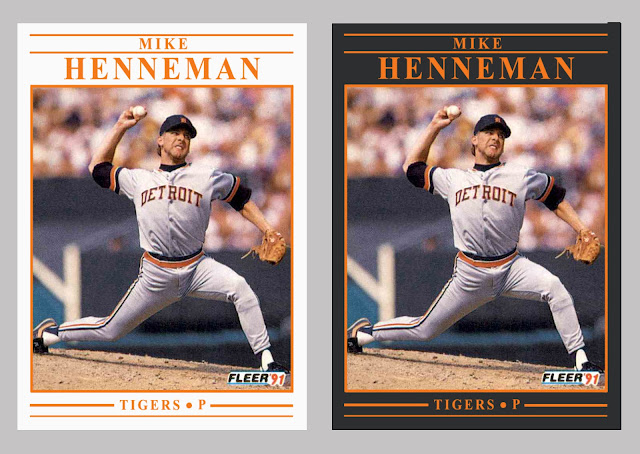
A couple of months ago, I posted a preliminary redesign of what was originally a very yellow 1991 Fleer baseball card set. I say preliminary because by the end of that post I just couldn't decide which of two border color ideas I liked better: white or charcoal. So, I asked you, the readers, to contribute your thoughts.
 
The comments were just about even between white and charcoal, so instead of choosing one border color or the other for the complete redesign, I figured I'd do both for each team. Bonus cards!

Just as with the 1992 Fleer redesign I did a while back, I tried to choose a card for each team that featured a well-framed shot, a good action shot, or otherwise interesting subject matter. As you'll see, I think the Fleer photographers captured some gems that season.  
 
First, here's a reminder of what the original cards look like. Jack Clark is wondering why so much yellow.


Now here's the redesign for each team, in alphabetical order by city name. 


I think I like some of the teams better in white (Brewers, Yankees, Phillies) and other teams in charcoal (Orioles, Athletics, Pirates). And then there are some teams that look fine either way (Pirates, Cardinals, Blue Jays). Ultimately, I enjoyed the project, and I hope you like the way the cards turned out.
 
Any favorites of the bunch? Did I do your team justice with the color and image choice? 

Share in the comment section, and thanks for reading.

Sunday, September 12, 2021

Completed Set: 1988-89 Esso All-Star Collection

Many of you readers and collectors might know the name Esso as a brand of gasoline, but did you know that they put out a set of collectible hockey cards during the 1988-89 hockey season?


Well, they did! As you can see on the header card above, it consisted of 53 players, both active and retired. And now I'm happy to say that I've got all the cards in my collection.
 
Similar to the 1988 Topps UK Mini set that I completed last year, I compiled all the cards in this set through trades on TCDB.
 
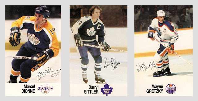
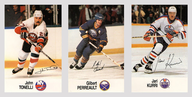
Because the design on the front of each card is the same, regardless of the team, I'm not going to show every single card. But here are some images that stood out to me, along with more information about the set.


First we've got some absolute legends of the game, captured in nice action and high quality color.


Another trio of legends. Beauty of a glove save there by Gump Worsley. And check out his leg pads. Those things look like they must weigh 50 pounds each. I also love those Toronto Maple Leafs uniforms that Mr. Mahovlich is sporting. So classy.


You'll have noticed by this point that the cards are a bit smaller than standard. They measure 2 1/8" x 3 1/4". The card stock is also different—definitely thinner than typical stock of the erabut there's a good reason why, as you'll see below.
 
First, more cards.


Here's Ken Dryden being flanked by two of the fastest skaters of their eras. (They even look fast on their cards, don't they?)


Next we've got three super-talented Islanders from their Stanley Cup run. Clark Gillies is really pushing hard to skate uphill.


Where could you find all these cards during the 1988-89 season? They were distributed in packs of six at participating Esso gas stations in Canada. I'd have to imagine young hockey fans would have been psyched whenever mom or dad pulled into an Esso station to fill up—especially if they found the guy on the right side of the above trio in their pack.


We've been getting into the modern players now. Here Boston's captain, McDonald's mustache, and Smitty's classic helmet and cage combo.


Some great playmakers here. Good framing on all three photographs. As simple as the card design is, I think it works rather well. Big, clear team logo. Player's last name in all caps.


Here are three teams not yet featured. Ron Hextall looks like he's about to scramble to his right and stretch out to make a pad save, while Luc and Mario sport their classic '80s uniforms.
 
Of the 21 teams in the league at the time, 16 were represented in the set. The absentees? Blues, North Stars, Canucks, Devils, and Whalers. It's a shame that some of those great players and iconic team logos were ignored (Ron Francis in a Whalers jersey or Neal Broten in a North Stars jersey, for example.)


Finally, here's an example of a card back, featuring the full checklist. Every card in the set has this same back. But there's a good reason why, and it's the same reason why the card stock is noticeably thinner:


The cards were meant to be placed in an album!

What a classic '80s thing for Esso to do.


Here's a look at an interior page, with spaces designated for each card. Just a quick career stat line and very brief bio underneath.

The cards don't have any sort of adhesive backing, which means kids must have used glue or tape to affix them to the album's pages. (I think I just felt some of you cringe a little bit.)


And here's a page with cards included. 
 
Interestingly, although there are 53 players represented in the album, only 48 of them received an actual card. The other 5 players had their photos pre-printed on the designated page. The image of Al MacInnis on the left-hand page shown above is one example. I wonder why they did that. Maybe there were only 49 spaces available on the printing sheet? (7 cards across and 7 cards down?)
 
Regardless, I'm very happy to have completed this set. The fact that I did it solely by trading away cards in my collection that I had no use for makes it that much sweeter. I haven't picked up an album yet, but after some quick research I do see that empty albums are available on eBay, and they're relatively affordable. Maybe I'll grab one. If I do pick one up, don't worry—I'll keep the cards separate.
 
What are your thoughts on this Esso set? If you were a kid living in 1980s Canada, would you have been regularly checking the gas gauge on mom or dad's car, reminding them that there was an Esso station nearby, and that they should top off the tank?

Share in the comment section, and thanks for reading.

Sunday, September 5, 2021

Custom Cards: PRINTED (Plus a Giveaway)

 
Big news from Nine Pockets Headquarters:


My custom cards are now available in print form!

After spending a few months looking into various printing companies and their products, services, and prices, I finally found one I felt good about and went for it. 
 
Here are a couple of close-ups of the finished product:


I'm happy with the results. The cards have a similar thickness and feel to the standard "vintage" card (i.e., 1980s and earlier). Slight gloss on the front, no gloss on the back. 
 
And speaking of backs, here are two examples.


Instead of basing each card back on whichever Topps design appeared on the front, I decided to give them more of a "compete set" feel. The cards are separated into series by year, and they're numbered in the order in which I designed them. For example, George Costanza up there was the first custom card I created in 2019, so he's card #1 in the 2019 edition. And likewise, the Toxic Twins card was the 11th that I created in 2020, so it's card #11 in the 2020 series. (Note the different ink color for the 2020 backs.)
 
Also note the hand-stamped Nine Pockets "NP" circle in red, which is my little way of letting you know that you've received an authentic custom card, straight from the source.
 
For a card like Costanza's, which compares a celebrity's likeness to a ballplayer on an original Topps card, I thought about placing a small image of the original card on the back (à la 1991 Stadium Club). However, that would have been clear misuse of property I don't own. Instead, I decided to go with a brief write-up that mentions the original card. Collectors can then use that information to look up the originals themselves. Maybe that makes it a more fun, interactive experience. There's too much instant gratification in the world these days, anyhow.
 
So, what am I going to do with these cards now that they've been printed out?


I've set up a store on bonanza.com where the cards can be purchased for prices that I hope everyone will feel are affordable. The site offers some built-in marketing and advertising features, so I'm interested to see what kind of traffic it brings in.

But wait. Don't purchase anything from the store just yet. I have some gifts to give out. If you're one of the first 20 commenters below, I'm going to send you three custom cards of your choice.
 
It's a way to thank you for reading about my designs and for always leaving such enthusiastic, complimentary comments here on the blog.
 
Here's what to do:

(1) Go to my custom card gallery and find three cards you'd like from the 2019 and/or 2020 lists. (I haven't ordered the 2021 designs yet, as I'm still working on a couple more.) The only options from 2019 and 2020 currently unavailable are the Sadaharu Oh stained glass card and the Mr. Bean Topps Giant card.
 
(2) Come back here and leave a comment that includes your three card choices, plus one consolation choice just in case there's high demand on a particular card and I start running out of stock.
 
(3) email me with your mailing address. A link to my email address appears on my blogger profile page. You can also contact me on TCDB.
 
And that's all you have to do. 
 
Thanks so much again for spending some time here at Nine Pockets, and for helping to fuel my creativity. I look forward to getting some of these cards into the hands of fellow collectors.