Sunday, November 27, 2022

Baseball in French, Lesson 1: La Balle Papillon

Here's a fun little baseball card I came across recently that was issued in 1986 by Leaf, the Canadian counterpart to Donruss.


It hearkens back to fun times for collectors, and for Phil and Joe Niekro, who for a brief period found themselves both playing for the New York Yankees.
 
The caption on the bottom of the card refers to the Niekros as "knuckle brothers" — fitting as they both threw the knuckleball. But have a look at the French heading on the back of the card.


Frères Balles Papillon is the French translation of "knuckle brothers". Do you know how those French words translate back to English? 

Butterfly Ball Brothers

That's right. The French term for a knuckleball is balle papillon (butterfly ball).

Just think of the way a butterfly travels through the air, and then think of the way a knuckleball travels toward home plate.
 
Those French folks, I tell you what. They've got a romance for language.
 
And don't get me wrong, our own terminology of baseball is far from literal and dry. Relief pitchers are housed in the bullpen. A lazy fly ball is a can of corn. A home run is a dinger, a tater, a round-tripper. A pitch that's high and tight is chin music. A swing and a miss is a whiff. A ball hit hard on a line is a frozen rope.

But after I discovered la balle papillon, I did some research to see what other French baseball terminology existed. Turns out they've got a lot good ones, too. I started to wonder if many American baseball fans were aware of them. If not, that would certainly be reason for me to share.
 
Instead of listing them all here, however, I've decided to make it a series of blog posts. Each post will cover one French baseball term that I think many of you readers and collectors would find interesting, or entertaining, or clever.

And because this is a trading card blog, I'm going to try to add at least one French-inspired baseball card to each post—most likely an Expos player. And most likely an O-Pee-Chee card. Because that only makes sense.

I'll spread out the posts over this coming year, so stay tuned. Or reste à syntonisez.

Sunday, November 20, 2022

This Custom Card is Going Straight to the Principal's Office

Over the past few years I've created some custom cards featuring dudes who many would consider troublemakers. Harry Callahan, Logan (a.k.a. Wolverine), Rick Vaughn, El Mariachi. 
 
But never have I featured three on the same card like this:


I mean, just look at those guys. You know it's only a matter of time before they'll be sitting in detention.
 
The card is based on the 1971-72 Topps hockey "leaders" design. The subset featured goals, assists, and points leaders from the previous season, along with goalie wins, shutouts, and goals against average leaders. And although a penalty minute leaders card wasn't featured in that set, a few other hockey sets in the 1970s did include one, and that notion of three miscreants on a card provided all the inspiration I needed. I really like the bright yellow color bar and big, bold red text that runs across the top, as well as the look of the player images inside the blue ovals.

But that's not all. I also designed a card back.


I figured Bender would be the overall leader in absences, followed by Spicoli and Bueller. Note specifically how many absences Beuller has. Fans of the film Ferris Bueller's Day Off will know exactly why I chose that number.
 

Principal Rooney: So far this semester he has been absent niiiinnne times.

Ferris' mom: Niiiinne times?

Principal Rooney: Niiiinne times.
 
Ferris' mom: I don't remember him being sick niiine times.
 
Principal Rooney: That's probably because he wasn't sick. He was skipping school. 


Of course that number would suddenly be reduced to 2, right in front of principal Rooney on his computer screen, but we all know 9 absences was the actual number.


To fill out the top 10 on the leaderboard, I added a cast of characters from other films that revolved around the high school experience, such as Danny Zuko from Grease, Lane Meyer from Better Off Dead, Gary Wallace from Weird Science, and both Bill S. Preston and Ted Logan from Bill and Ted's Excellent Adventure.
 
Sharp-eyed card collectors might notice that quite a few of these ne'er-do-wells, slackers, and mischief makers attended the same high school—Shermer High—even though they appeared in different films. That's because filmmaker John Hughes was the man behind quite a few of those iconic movies, and he used the same high school name each time.
 
I really wanted to get Chris Knight from Real Genius onto the list, but it turns out the school in that film was a college, not a high school. I also thought about adding a couple of characters from Parker Lewis Can't Lose, but that was a television show, while all of the other characters on the card are from feature-length films. So I decided against it.

Regardless, I had a lot of fun designing this card, and I hope you're getting a big kick out it.

Do you have a favorite high school–themed movie? Favorite character?
 
Share in the comment section, and thanks for reading, as always!

Sunday, November 13, 2022

Completed Set: 1984 Topps Baseball

 
The 1984 Topps baseball set is a special one for me. It's the first set of cards I remember collecting. The first wax packs I opened. The first sticks of gum I chewed. Here's a related memory:
 

Back in 1984, my dad was living in Manhattan while my sister and I lived on Long Island with our mom. Every other Friday evening, dad would drive out to the island in a maroon Honda Civic hatchback to pick up his two kids for a weekend in the big city. The trip back to Manhattan took about an hour (without traffic), and during those rides, my sister and I would excitedly share events from the previous two weeks with dad: schoolwork, teachers, friends, Little League games, softball games.

And for the year of 1984 in particular, there was even more to look forward to on those rides: 

A small brown paper bag tucked between the seats of the car, filled with packs of Topps baseball cards. 

After we caught up with dad, my sister and I would divide the packs evenly and start opening them. We were still too young to have a favorite player or an allegiance to one New York team over the other, but we both loved baseball. I remember that whenever we found a hometown player in those packs we’d call out “Mets!” or “Yankees!”, and dad would ask us which player we got. What a great time.

 
And to this day, whenever I see the bright blue "Mets" or dark purple "Yankees" text running down the left-hand side of a 1984 Topps card, I think of those car rides.
 
Fortunately, even without the personal nostalgia, the set design is quite memorable. Along with the instantly recognizable font choice for the team name, there's also the picture-in-picture effect and plenty of good-looking photos.
 
Let's go through some of them together.


You've got your share of classic "sunny day at the ballpark" poses. Combine that with some powder blue uniforms and sweet team logos and fonts, and you've got a happy 1980s card collector.


There are plenty of batting stance poses as well. Here, Ozzie Smith and Lloyd Moseby show off the all-star card design, while Gibby is looking like a stud in the batting cage.
 
But there are also many intriguing shots in the '84 Topps set—cards that come together to really enhance the anticipation and potential excitement that is the story of baseball. Check out this progression:


The pitcher looks in for the signs...


 The batter takes his stance...


The fielders prepare themselves...


Here's the wind-up...


And the pitch...


It's a hit!
 
And that's the essence of baseball, isn't it? It's definitely what you'd want to capture on at least some of the cards in your set, and 1984 Topps did well here.


They also did well to get some catchers into the action.


Stars of the era got some good action shots, too.


As did the rookies.


Let's look at some of the subsets now.


On the left you'll see an example of a league leaders card, which was standard Topps procedure. (Tim Raines had 90 stolen bases in 1983, while Rickey swiped 108. Who else misses those days?) Topps also created a card for each team's batting and pitching leaders, as shown on the right. Nolan Ryan is almost smiling there, which is quite a departure from the typical stare-down you see on his cards.


Interestingly, Topps also added an "Active Career Leaders" subset. It's a great little snapshot into the star power of the era, don't you think? I like how the career totals up to that point are listed right on the front, too.


Next up, we've got a manager card, along with two different highlight card designs. The card in the middle documents Henderson stealing 100+ bases for the third time in his young career. On the right, Topps paid tribute to three legends who'd retired at the end of the previous season.
 
 
Here's an example of a card back:


The color combination works very well. I have no problem reading that dark text against the light background. In addition, there's a nice big red number at the top left, an equally big player name at top center, and then an even bigger team logo top right. Well done all around.


Next up is an example of a checklist card from the set:


And finally, here are a couple of sweepstakes cards, inserted one per wax pack.


And that's 1984 Topps. 
 
Personal nostalgia aside, I think the design and photography are very solid. Some of the card colors do match up with the team colors a bit better than others, but overall it's bright, attractive, and kid friendly. And while some of the photos are a bit grainy, blurry, or faded, most are certainly nice and crisp. That doesn't sound like much of a compliment, but for the era, it was a pretty good showing.
 
I've actually completed this set for a second time recently, and it's just as special as the first set.

What are your thoughts on 1984 Topps? Favorite cards?
 
Share in the comment section, and thanks for reading!

Sunday, November 6, 2022

On Creative Inspiration (Plus a Giveaway)

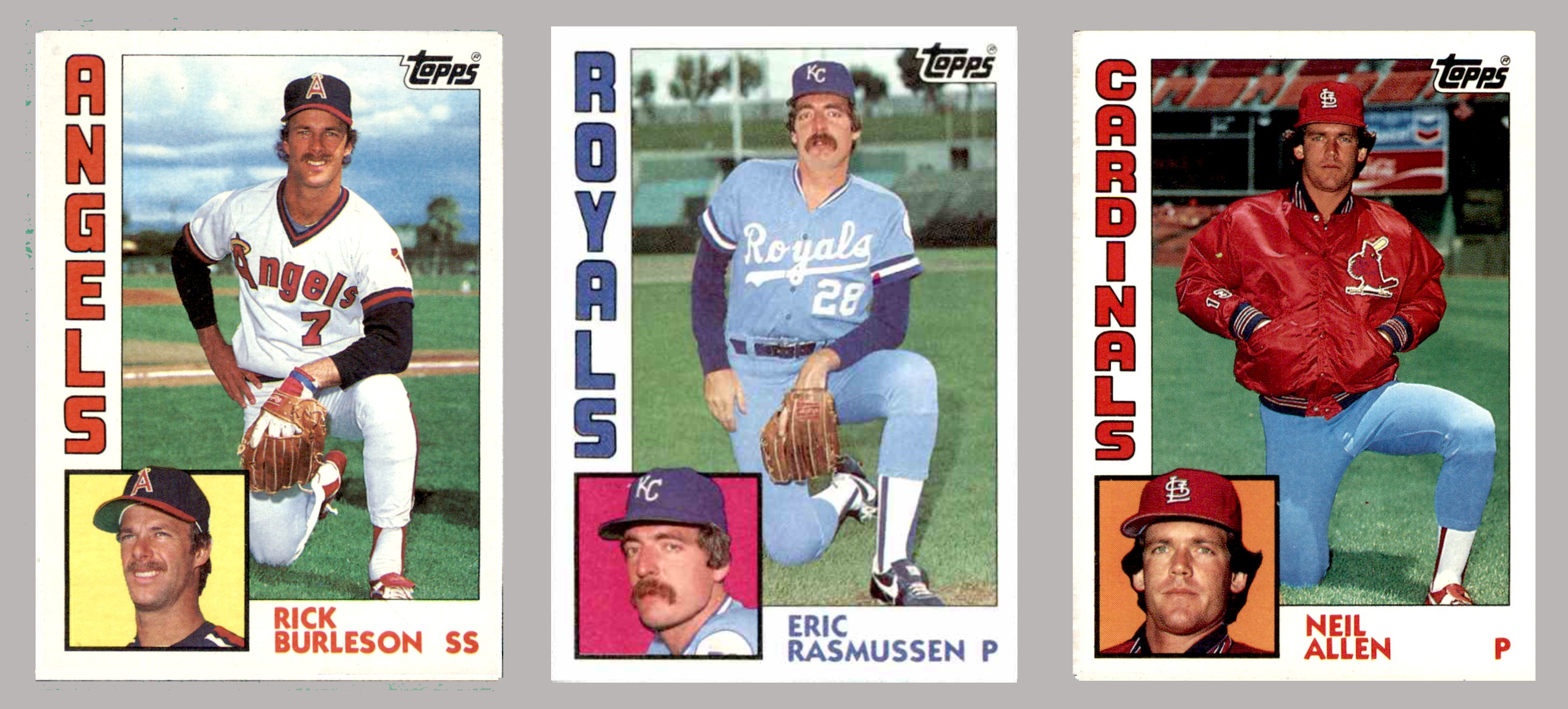
Over the years I've discovered that my creative energy often comes in waves. There are spans of time when I'm not exactly inspired, and therefore don't do much writing or graphic design. And then there are other spans of time when I just churn out creative projects, one after another. Even if I'm not actively designing something during those waves, let's say because I'm busy working my 9-to-5 job, I'll be jotting down some notes about a design that I can't wait to work on later.
 
Despite the extra screen time and the early-morning or late-night sessions (inspiration can come at inconvenient hours), it can be exhilarating. There have been plenty of times, for example, when I've worked on a look-alike custom card and laughed out loud when I really started to nail the resemblance of the character on the custom card to the athlete on the original. They're amazing times, and I've come to enjoy and cherish them.

Well, a few years ago, one of those creative waves helped me generate a set of baseball player designs based on a vintage 8-bit video game. Here's a sampling:


It took a while to get through every team in the league, but I had enough fun with the project that about a year later I found more time to modify the design for hockey. Another sampling:


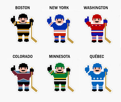
I had even more fun with the hockey guys, and after spending a few sessions creating a standard uniform for every team, I added a handful of throwback and Olympic options.
 
After that, however, I was pretty wiped out. I couldn't even think about creating these characters for the other major sports. So I set the project aside for a while and started focusing my creative time and energy toward other things, like coming up with content for this blog and designing custom cards.
 
I did so much work in those areas that a good couple of years went by before I'd catch the 8-bit wave again. When I did, the first new sport I thought to try was soccer, as there's a wealth of teams and leagues to choose from. 
 
I started out with some Premier League teams.


 Then I thought National teams would be fun to try.


Fast-forward a few more weeks and I'd finished 20 Premier League designs and 22 National team designs. It was quite a time!
 
After a break for a few months, I was ready for another sport. Thinking that a football design would take much more doing (helmet, face mask, shoulder pads, and knicker-style pants), I decided to put that sport on the back burner and go for basketball instead.


After I finished all the teams, it was only a matter of weeks before I attempted the football design. Look here:


I felt pretty good about the way they turned out, and also did some throwbacks, like New England, Tampa Bay, and Seattle.
 
And with football done, all the major sports were finally checked. Here's where they live now:


It's an independent artist website called redbubble, where you can sell your artwork on all sorts of items, from t-shirts to mugs to pillows to fridge magnets to acrylic blocks (whatever those are).  
 
For the past couple of years, the baseball and hockey designs have been available there, so I decided to add the rest of the sports as well.
 
From sales thus far, it's clear that these little 8-bit guys are most popular as fridge magnets and stickers. The stickers are just about the perfect size to stick on the side of a binder or a storage box, like this:


I don't actually have binders and boxes full of Astros, Dodgers, Expos, Canadiens, Penguins, or North Stars cards. Those are just sample stickers I ordered to see what the finished product looked like. But I do still have some of those samples left.  
 
If any of you are interested in the teams shown below, let me know in the comment section and I'll send the sticker out as a small way of saying thank you for reading the blog. There's only one sticker available for each team, so the first commenter to claim a team will get it. (One sticker per person, please.) Even if none of the teams interest you, please feel free to claim one for a friend, coworker, or family member. 


Baseball: NYM, NYY, Houston


Hockey: Pittsburgh, NYR, Edmonton


Premier Soccer: Liverpool, Newcastle


National Team Soccer: USA, Brazil


Basketball: Boston, Portland


Football: San Francisco, Green Bay, NYG


If you do claim a sticker and haven't sent me your mailing address at some point during a previous giveaway, be sure to do so. (Check my blogger profile page for my email address.)
 
You can also message me on TCDB. Here's my TCDB profile page.


Back to the topic of creativity. Here's a question for you:
 
Whether you blog or do anything else in the creative realm, do you find that your creativity comes in streaks, or can you whip up content on demand?
 
Leave your experiences, along with a sticker claim, in the comment section.
 
Thanks for reading!