Sunday, January 30, 2022

This Custom Card's Got it Bad, Got it Bad, Got it Bad

Time for another look-alike custom card. First, the original:


1974-75 Topps #10, Pete Maravich
 
 
Any idea who the look-alike is? 
 
Here are some hints:
 
Maravich knew the value of jump shots. The look-alike would agree, telling Pete that he might as well jump.
 
Maravich played professionally in Atlanta, New Orleans, Utah, and Boston. The look-alike got his big start in Pasadena, but is known for singing out the name of a country: PA-NA-MA!
 
Maravich was hot for basketball, while the look-alike might say he was hot for teacher.
 
Okay, that's probably more than enough hints. Here's the custom card.


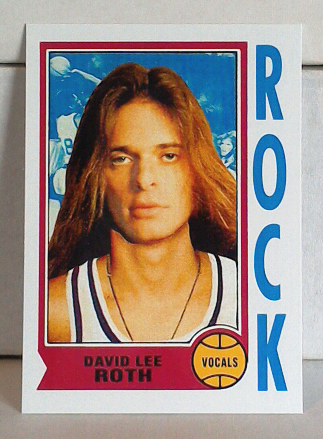
It's David Lee Roth from Van Halen!
 
And the similarities don't stop at facial features. 
 
Both men had great alliterative nicknames. Maravich was known as "Pistol Pete". Roth was often referred to as "Diamond Dave".

And then there's the fact that both men were outright entertainers. Maravich, in fact, may have been the seminal "showtime" type of basketball player in the NBA, dishing out flashy assists and putting up big numbers when healthy. (As just one example, he scored 68 points in a game against the Knicks in 1977—and that's before the invention of the three-point line!) At that same time, Roth was becoming one of the best entertainers in the world of rock music with his acrobatics, stage presence, and voice. Just imagine him as a pro basketball player back then!
 
As for the card design, I switched the player position on Roth's card from "guard" to "vocals". I also switched the team name from "Jazz" to "Rock". Pretty good symmetry there, don't you think?


Now a little more about the man on the original card:

Pete Maravich was solid right from the start of his pro career, being named to the 1970-71 All-Rookie Team at the end of his first season. Overall, he was named to four All-NBA teams and was a five-time All-Star. He was elected to the NBA Hall of Fame in 1987.
 
His best year was likely 1976-77, when in 73 games played he led the league in points per game (31.1) and minutes played (41.7). Across the season, he also led the league in field goals attempted (2,047), free throws (501), and points (2,273).

Career numbers: 658 games played, 24.2 points per game, 4.2 rebounds, 5.4 assists, 44.1 field goal percentage, 82.0 free throw percentage.
 
At the time of this writing, Maravich ranks 20th on the NBA all-time list for points per game (24.2). That puts him just behind players like Larry Bird and Kareem Abdul-Jabbar, and just ahead of players like Shaquille O'Neal and Rick Barry. He's also in the top 100 in NBA career assists per game (5.41), placing him 92nd.
 
And a little more praise: During the 1996-97 season, the NBA released its list of 50 greatest players in league history, and Maravich was chosen as one of the 50. He was also a selection for the 2021-22 NBA 75th Anniversary Team.
 
So here's to Pistol Pete. And to Diamond Dave. And to another custom card in the books.


Now here's a Van Halen question for you: 
 
David Lee Roth, or Sammy Hagar?
 
I choose Roth. It's nothing against Sammy Hagar, because Van Halen put out some decent music with him at the mic as well. But for me, you just can't beat Diamond Dave and that early Van Halen sound.
 
Let me know your choice in the comment section. Thanks for reading as always!

Sunday, January 23, 2022

Board Advertisements on Cards, Episode 1: Body Glove

Way back in 1978, the NHL allowed teams to start selling advertising space along the boards of their rinks. By the time I was a hockey card–collecting kid in the late 1980s, the trend had caught on. From snack foods to car manufacturers to banks to fast food restaurants, board advertisements really ran the gamut—and they still do.
 
This series will explore some of the advertisements that also managed to make their way onto hockey cards.


1990-91 Upper Deck #126, Brian Bellows

There's Brian Bellows on his 1990-91 Upper Deck card. Notice that advertisement beside his right arm? It's for a company called Body Glove. Here's a better view of their logo.


The company still exists today, largely in the same form. They sell swimwear, surfing gear, and more, and appear to be as popular as ever.

For those of you wondering why in the world a company that catered to the culture of surf, sand, and sun would want to advertise in a hockey rink, I understand the befuddlement. But there's a good explanation.

Look at the hockey card again. Based on the blue color of the dasher rail around the top of the boards (much more often they were yellow or red), and the fact that Mr. Bellows is wearing his road uniform, I'm going to guess that this game was held at the Great Western Forum in Los Angeles, where the Kings played their home games back then.

Hockey was booming in LA at the time, as Wayne Gretzky's recent arrival was bringing many more fans to the arena to watch the sport. And The Great One's influence stretched beyond the rink. Just look at this glorious magazine advertisement for Ultra-Wheels inline skates, for example.


Instead of jogging down the strip in Santa Monica or Venice Beach, you can bet more and more people were rollerblading—some very likely wearing Body Glove apparel. 
 
And if you're the Kings, you've got to advertise to your target market, right?
 
That raises a question. Did any of you own some Body Glove clothing back then? What about now? Share in the comment section, and thanks for reading!

Sunday, January 16, 2022

From the Favorites Box: Andre the Giant, 1990 Classic WWF #130

A series where I post some thoughts about favorite cards. Previous cards in the series are available here.
 
 
Quick exercise in imagination:

Picture yourself attending one of those 1970s wrestling exhibitions. You know, the kind where the local gym or civic center puts on a challenge: "STEP INTO THE RING AND LAST FIVE MINUTES AGAINST [insert wrestler of minor fame here] AND WIN 100 DOLLARS!"

Now imagine on this particular night you're feeling some bravado. A little spunk. (After all, you've been working out more than usual, and earlier this week your co-worker said "OUCH!" when you shook his hand.) 
 
And when no one in the audience accepts the $100 challenge issued by the master of ceremoniesnot even after some major-league cajoling—you walk right up to the ring and hop in there.
 
The raucous, spirited cheer from the crowd only emboldens you.
 
"WE'VE GOT A CHALLENGER!", the emcee yells out.
 
You turn left and right and put a hand up to acknowledge the audience. Then you strut around your corner while the emcee takes the microphone again and introduces the wrestler of minor fame that you'll be going up against. It's a guy who locals have dubbed "Andre the Giant".
 
You turn to the opposite corner and watch, stunned, as the behemoth lifts one of his size-24 feet over the middle rope and into the ring, and stares you down like so:


Suddenly the crowd is no longer on your side.
 
Is your first reaction to take a step back and reach for the ropes so you can get out of there? 

I'm pretty sure mine would be. And that would finish my exercise in imagination.

I'll let you finish your version of the story however you'd like. But that look on The Giant's face? That does it all for me. Why would he even need to trash talk? Or say anything? It's a special ability that not everyone has—not even every wrestler.
 
And simply for that special ability to intimidate without a word, like Andre is doing on his trading card up there, 1990 Classic WWF #130 has a spot in my box of favorite cards.

Sunday, January 9, 2022

Samurai Jack Custom Menko: PRINTED

 
Fun announcement:


I've printed out the Samurai Jack menko design!
 
It took a little bit of experimentation with dimensions, card stock thickness, and assembly, but I'm pretty happy with the way the final versions turned out. Here's the back:


They've got a heft and feel similar to menko of the mid-20th century. To make them even more period correct, I decided to give the edges of each card a slight "aged" look. The red NP stamp on the back is also a nice little nod to the way menko were sometimes stamped in the golden days.
 
As for size, these cards are based on a vintage menko that measured 1 3/8" wide by 2 7/8" tall. Seems like that's pretty standard, but it does push the height of an Ultra-Pro or BCW tobacco sleeve just a tiny bit. (The top edge of the menko will come right up to the top edge of the sleeve.)

Ryan from Japanese Sumo Wrestling Cards and Menko, since you so kindly helped me verify the Japanese characters on the front and back of this menko while I was first creating the design, I'm going to send a copy to you as a way of showing my appreciation.

I'm also going to mail out a copy to the first three readers to leave a comment describing their favorite episode or favorite character from the Samurai Jack series.
 
If you're one of the claimants and I don't already have your mailing address from a previous giveaway, here's how to reach me:
 
My email address is available on my blogger profile page

You can also message me on TCDB.
 
Because I've only printed out a small amount so far, the rest will be split between my bonanza store and my eBay store. The price is set slightly higher than the other custom cards due to the time of assembly and cost of materials involved.
 
Stay tuned for more, and thanks very much for reading!

Sunday, January 2, 2022

Completed Set: 1987 Topps Football

Around this time last year I completed my first set of football cards. Because I'm not a football collector at all, I went with some low-hanging fruit: 1989 Topps
 
It was a fun set to complete—so much so that over this past year I thought I'd try to complete another set from the decade. The ambition to try one of those 528-card sets from the early '80s still wasn't there, so I decided on 1987 Topps, which, like the 1989 set, consists of a manageable 396 cards.
 
Overall, there's good bang for the buck here. We've got a few notable rookies, a sharp design that's also kid friendly, and some above-average photography. Let's get into the details.
 
The set starts out with a nice horizontal card that documents the previous year's Super Bowl, won by Bill Parcells and his New York Giants.
 
 
It sure was fun watching that team as a young kid growing up in New York. Lawrence Taylor, Phil Simms, Mark Bavaro, Carl Banks, Phil McConkey, Joe Morris. The list goes on and on.
 
After that, we see some definite similarities to the 1989 set. How so?


Well, just as in the 1989 set, there were some telephone cards in 1987. Always a treat. Even Joe Montana got in on the conversation, look.


There were also some excellent parka cards here. Another star QB of the time, Jim McMahon, makes an appearance.


In 1987, players also knew the importance of the pre-game stretch. I think a Topps photographer was feeling a little artsy when he snapped that Saints card of Rueben Mayes.
 
Standard fare aside, the 1987 set does boast some nice action shots.


These types of images do really well with the card's design. Those banners at the top, with their jagged ends and diagonal action, really lend themselves well to all the movement and power of football. The banner colors generally match the team, too. That's a bonus compared with the '89 set. No need for me to do a set redesign here.
 
The '87 set also contains a few nice rookie cards, plus a couple of "sort of rookie" cards.


I say "sort of rookie" because Doug Flutie and Herschel Walker had already played in the USFL—both for the New Jersey Generals—and had cards issued through that league. (Speaking of rookie designations, check out the bright Super Rookie banner on the Offerdahl and Sikahema cards. Nice work by Topps there.)

But because this was a set of the 1980s, there are also some stinkers in there. You'll find lots of headshots. Look at card numbers 102, 103, and 105, for example.


Oof.

There are also way too many images of dudes just standing around.


So many plain, uninspired images made some of the other dudes sad.


But there's still some good in this set. Many of the stars received nice-looking cardboard, for example.


Jerry Rice looks like he's just evaded a pass rush at Candlestick Park and is looking to throw the ball to a fellow receiver!
 
There are also some entertaining cards in the set.


Eric Dickerson shows us the Rec Specs (plus an almost unnoticeable All-Pro banner), Mark Clayton sports a pair of shades, not a tinted visor, and Garry Zimmerman shows us how tiny a Gatorade cup looks in the hand of a guy who's 6'6" and 280 pounds.
 
Now here are two examples of a card back.
 

Legibility is decent here, and I like the shield design. The color scheme is reminiscent of 1981 Topps Baseball.
 
Next, a couple of horizontal cards.


On the left, we've got one of the League Leader cards. On the right, an example of a team card. Teams were kept together in the set, organized by win-loss record, and each team started out with the horizontal team card. I enjoy the one-line summaries at the top ("Moon plots the play"), and oftentimes there's good action to be found. 
 
And here are a few subset cards.
 
 
On the left, one of the record breaker cards that start off the set. In the middle is an example of a special "1000 Yard Club" card that was issued one per wax pack. And on the right is a wax box bottom card.
 
Finally, here's one of the checklists. Very bright.


And that's 1987 Topps. Overall, it's a decent set. The design is fun and kid friendly, with two banners across the top that are color-matched to each team. There are some good action shots (could have used more), a few nice rookie cards, and a whole bunch of future Hall-of-Famers who can be had at affordable prices.
 
I'm happy to have completed it, and I think there might be even bigger football fish to fry next.
 
What are your thoughts on 1987 Topps football? Share in the comment section, and thanks for reading!