Sunday, April 30, 2023

Baseball in French, Lesson 5: l'Amorti

Welcome to Baseball in French, Lesson 5. Previous lessons can be found here.
 
Today's term is l'amorti.
 
In English, that translates to "the cushioning". What's the baseball translation?

Bunt.

Here are three Expos fan favorites, showing off their "cushioning" skills.


All three guys had speed, and all three could lay 'em down. Unfortunately I don't think Major League Baseball keeps track of bunt singles separately from regular singles, so I couldn't tell you how many each guy totaled for his career. But I can tell you how many career sacrifice bunts each had:
 
Raines: 39
Grissom: 38
DeShields: 57
 
 
As for the French terminology, I suppose I could get to enjoy it:
 
And here's the pitch. DeShields cushions it up the third-base line and sprints out of the box. . . the throw to first. . . not in time!

I'm just so accustomed to "bunt" being the word for it that anything else seems a bit odd. But when you think about it, "cushion" is a pretty good description of what's going on. I guess it's similar to an American broadcaster saying "pushes it up the line", or "taps it down the line".

What are your thoughts on l'amorti?
 
Share in the comment section, and thanks for reading.

Sunday, April 23, 2023

1986 Topps Tattoos are Pop Art

Recently I came across a 1986 offering from Topps that I was not aware of back then:
 
Topps Tattoos.


Topps Tattoos?
 
Yes. Topps Tattoos. Turns out they were sold in wax packs, with one continuous folded sheet of 18 tattoos inside. (Plus a stick of gum.) After some additional research, it turns out Topps also released a tattoo product in 1960, 1964, and 1971.
 
If I'd seen these on shelves at the local stationery store or drug store when I was a kid back in 1986, I'm sure I would have asked my mom if I could have a pack or two. All these years later, I'm happy to have the panels pictured above in my collection.
 
I'm not going to apply any of the tattoos anywhere on my person, but here are the instructions anyway, straight from a wax wrapper:


Let's have another look at the panel of tattoos above and talk about the design, though, because I do appreciate it.
 
Does it remind you of any works from the pop art era? Roy Lichtenstein's brightly colored comic book–style works come to mind. As does Andy Warhol's work. The Campbell's soup cans. Marylin Monroe. Pete Rose. 


And so I thought it would be fun to do a little pop-art tribute using a couple of the baseball players on my sheet of tattoos. But which ones?
 
Pete Rose had already been featured in some actual pop art, so he was out. Scott McGregor had the Magnum P.I. mustache and Cecil Cooper was sporting the '80s dad beard—both solid options. But I had to go with Mookie Wilson as my first choice because he's the happiest baseball player of the group.
 
Just look at him smiling in all those primary and secondary colors and tell me you're not happy now, too. 


For the second choice I went with Bruce Bochte, because what better way to capture the 1980s than to feature that pair of eyeglasses four separate times?


It was a fun time to be a young baseball fan. Fun players. Fun products. And this was a fun little project.

Do any of you collectors remember Topps Tattoos? Do you have any in your collection? Share in the comment section, and thanks for reading, as always!
 

Sunday, April 16, 2023

Completed Set: 1980-81 Topps Hockey


Ohhh, those 1980-81 Topps hockey scratch-off pucks. They still rankle hockey card collectors far and wide, more than 40 years after the set was released. But here's a message to those rankled folks:
 
You have the O-Pee-Chee version.
 
There. I said it.

You see, O-Pee-Chee didn't place any scratch-off material on the pucks in their version of the set. And it was larger too, topping out at 396 cards compared to Topps' 264. So you've got all the clean, unscratched cards you want there.

And I'll absolutely take the Topps cards if no one else wants them. It has everything to do with the nostalgia factor.

If I were a young, unassuming, hockey-loving kid growing up in the States in 1980, I would have probably devoured this set with gusto. The scratch-off surface would have been a bonus, not a deterrent.

Who's that player? Lemme see! (Grabs a quarter and starts scratching.)
 
Back at that time, cards were still fun things you bought in packs for 25 cents. You'd open the wax wrapper, chew the stick of gum, flip through the cards, and then what? Sort them by number or team, assemble them into a stack, and stick them in a drawer or a shoebox. You might even rubber band them.
 
Simple.

And listen, with 10 cards per pack, would I have lost enthusiasm to scratch every card after a couple of packs? Probably. But that's okay, too. The set is still a fun one. And now that I've said my piece, let's get to the cards. Scratch-offs aside, I think you'll find that it's a pretty solid set.

First things first:  
 
Please rise and remove your helmets for the playing of our national anthems.


O Canada! Our home and native land...


O say, can you see, by the dawn's early light...


Speaking of O say, can you see, perhaps the coolest thing Topps did in this set was to honor the US Olympians from the recent Miracle on Ice team by applying a USA hockey stamp to their cards. That would have provided even more excitement for a hockey-loving kid growing up in the US back then. (How big was the US Olympic victory? Even O-Pee-Chee, a Canadian company, added the USA hockey stamp to those specific cards in their set.)


You know what else must have been cool? Finding these cards featuring goalies in their classic white masks and brown leather pads.


Bonus: Goalies sporting the towel tuck.


There's plenty of action captured in this set as well. Check out those five skaters zooming around Rangers goalie John Davidson. He's ready for the onslaught, though.

On the subject of action, let's talk about the design of these cards. The diagonal team bar across the bottom helps show motion and energy, which is fitting for the sport of hockey. And whether you like the scratch-off idea or not, the hockey puck shape is fun. Then you have the thin colored border around the card, which sometimes matches the team colors (Bruins yellow, Canadiens red, Flyers orange), and other times doesn't (Black Hawks green, Whalers purple, Flames green). But that's no big deal here. The colors are bright and fun. You get those magentas and cyans and oranges and yellows.


You've got some big rookies in this set as well. From left to right, there's Mike Gartner, Ray Bourque, and Michel Goulet. I'm pretty happy that all three of these guys have unscratched pucks, as well as the second-year Wayne Gretzky card at the top of this post.


You know what else I like? Classic hockey jerseys. You already saw some of them earlier in this post, but I'll reiterate with the six cards here: Those are some fantastic designs. (Even Vancouver's "flying V" design is great in its awfulness.) They're so fantastic, in fact, that over the past few years many of them have made comebacks in one form or another during special retro game nights around the NHL.


One downside to the set would be the airbrushed cards. For Billy Harris (left) and Dave Lewis (middle), it was bad enough that they were traded away from the New York Islanders right before the team would win four straight Stanley Cups. But now they're also airbrushed into Kings uniforms? Robert Picard (right) seems to think that's a little cruel and unusual. And I'd agree.


A second downside, some might say, would be the lack of a player name on the card back. But if the player name did appear on the back, there'd be no reason to have the scratch-off material covering up the name on the front. 
 
As for colors, the green text on a dark yellow background isn't the best for readability, but it isn't the worst either. So it's fine. Besides, there are some nice cartoons to be found throughout the set. 


Now let's get to the subsets.


There were some record breaker cards to start things off, including a couple of records set by youngsters. (Bourque's record was most points by a rookie defenseman, 65.)


Players named as first-team and second-team all-stars received a separate card in the set to go along with their base card. Check out the design on the back. Although sparse, I really like it. Who else hears the sound of wooden stick on puck?


There were two types of checklists included in the set: a team leaders card (front and back shown) that included each player's position and uniform number, and then a standard checklist. The standard checklists did not receive the scratch-off treatment, but all of that material covering the team card more than made up for it!


In the middle of the set, you had the typical group of league leader cards. Got to love the penalty minute leaders. How about these season totals: Jimmy Mann 287 PIM, Dave Williams 278 PIM, Paul Holmgren 267 PIM.


The final three cards of the set documented some of the previous season's playoff action. I love that image of the Broad Street Bullies skating onto the ice as a team, looking like a pack of hungry wolves. Interstingly, these three cards also did not get the scratch-off treatment.


Finally, one team pin-up was included in each wax pack. These paper inserts folded out to a size of about 4 x 7 inches.
 
Let's get back to the scratched vs. unscratched thing for a moment. Looking through all the cards above, you've noticed that some are scratched, and some are unscratched. That means I've completed this set in the most basic form. And I'm fine with that.
 
I'm not looking to immediately increase the difficulty by trying to assemble an entire unscratched set, or anything. But I thought it would at least be beneficial to know how close I currently stand to that achievement. So I went through the binder, page by page, and tallied the scratched and unscratched cards. Here's the breakdown:
 
Scratched:130
Unscratched: 129
No coating: 5

That means I have almost exactly 50% of the set in unscratched condition, including the Bourque, Gartner, and Goulet rookie cards, as well as the Gretzky base card. It's an intriguing percentage, especially with those big cards already crossed off the list. I'll have to give this one some more thought.
 
In any case, scratch-offs aside, there's a lot to enjoy about this set. Fun colors, some nice-looking subsets, good cartoons, and classic uniforms.

What do you think about the 1980-81 Topps hockey set? Should I go for a fully unscratched set next?

Leave your thoughts in the comment section, and thanks for reading as always!

Sunday, April 9, 2023

A Piece of Childhood Reclaimed: Entex Hand-Held Baseball Game

Let's go back to my mid-1980s childhood for a moment.
 
I was a baseball-loving kid from New York, spurred on by mom and dad, friends, Little League, the trading card boom, and a golden age of local professional baseball. The Yankees had Mattingly, Rickey, Righetti ("Rags"), Pagliarulo ("Pags"), and Winfield. The Mets had Strawberry, Gooden, Hernandez, Carter, HoJo, and that entire cast of characters who were about to win a World Series.

And video games were everywhere. At that point in time they were coming in all imaginable varieties, from full-on arcade cabinets to the smallest, dinkiest of hand-held consoles.
 
Well, at some point last year, a memory from that time popped up: I had one of those hand-held consoles. Specifically, a baseball version. 
 
I must have only been 6 or 7 years old at the time, so I couldn't remember the name, model number, or company that manufactured it. But the image of the console? And the sounds it produced? I sure remembered those. I figured I might be able to find the game with a quick online search using keywords like hand-held, baseball game, and 1980s. (Take a moment to enter those keywords into a search engine, select the "images" filter, and marvel at the sheer variety of games that come up.)

Happily, among the outrageous number of results, I did find an image of the same game that I had all those years ago. And better yet, after plugging the game's specific name into an eBay search, I found that there were quite a few working models up for auction at reasonable prices!

The nostalgia factor was high here. High enough, in fact, that I placed a bid and soon reclaimed that little piece of childhood.
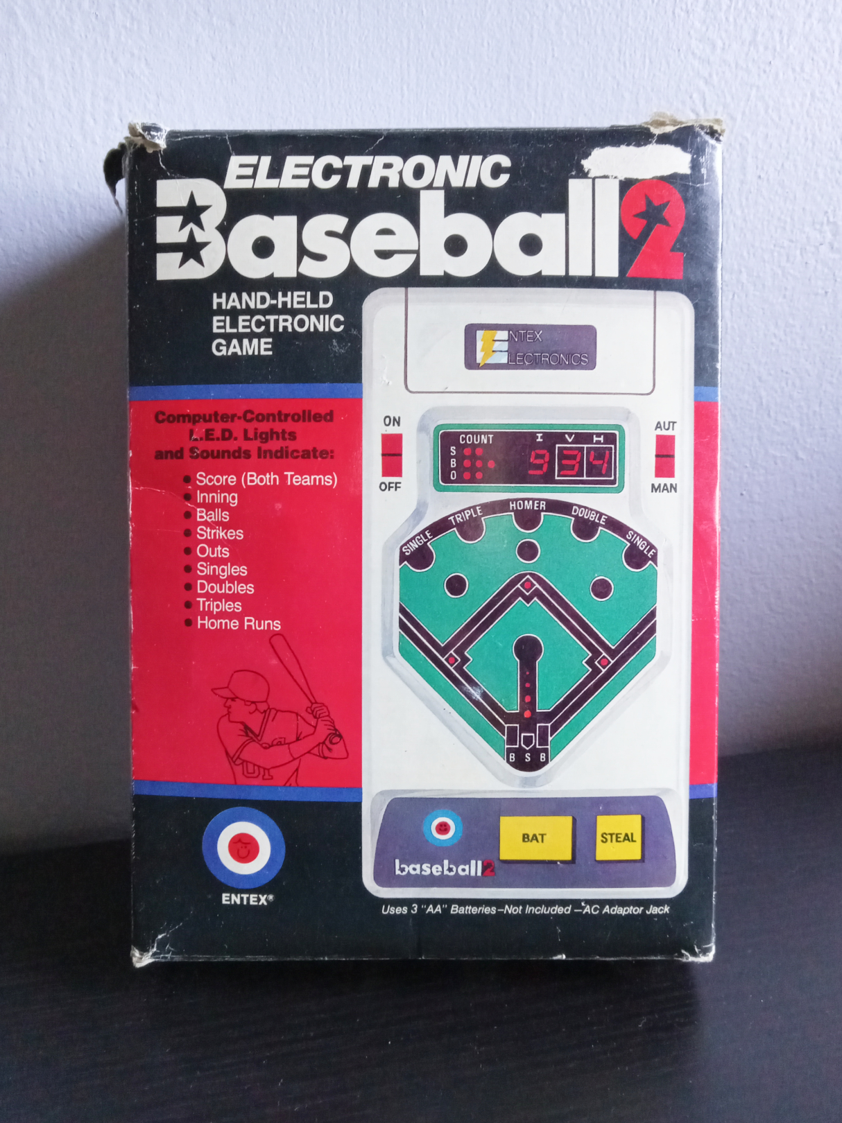
Here it is:


Electronic Baseball 2, brought to you by Entex Electronics. Complete with box! Here's a look at the back. Check out that detailed inner panel.


And even more details on the flap. 


"Knuckle-ball" speed control
Continuous cumulative scoring for both teams
Inning indicator
Base stealing
Sacrifice fly
Double play
 
And best of all...
 
No TV set Needed!

Also included was a fairly detailed instruction booklet.


And even a scorecard! (Be sure to make some photocopies. Only one scorecard is included.)


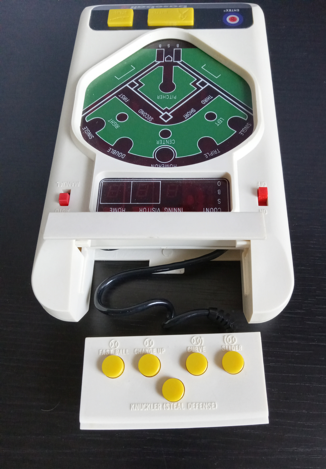
Now let's look at the console itself.


Who needs a fancy touchscreen when you have those glorious buttons and switches?
 
 
Here's a look at the two-player mode with the pitching controller detached, ready for game play.


And a closer look at pitch selection.


It's interesting to note that the fastball does move noticeably faster than the other pitches. The change-up stays straight like the fastball, just slower in speed. The curve breaks around one side of the plate, whereas the slider breaks around the other. Sometimes those two pitches will come back around for a strike, while other times they stay outside for a ball. As a hitter, you can choose to swing or lay off. If you do swing, it is possible to make contact on both of them for hits or outs. 
 
Then there's the "knuckler" option. It's only available in two-player mode. However, you don't select it as your pitch. Instead, you select a change-up, curve, or slider. Once that pitch is on its way to home plate, you can press the knuckler button, and it'll speed up the pitch. As you can imagine, this can completely throw off the timing of the hitter. The knuckler button also functions as a catcher's throw to second base if your opponent attempts a steal, which the game indicates with a separate warning sound.
 
Considering the game has a copyright of 1979, I'm impressed with all that sophistication.
 
You know what else is sophisticated? Your timing when you press the "batter" button actually affects the outcome of your swing. Tap the button too early, and the batter "pulls" the ball to third base or left field, often for an out. Swing too late, and the batter "pushes" the ball to first base or right field, again, often for an out. (Yep, the batter is always considered right-handed in this game.) There's some randomness to the game too, of course. But you do need to practice your timing.
 
Want to see some game play now?


What a festival of 1980s sights and sounds and technology.

With the demonstration complete, I'm not sure how much I'll actually play this game. Battery-operated electronics that are 40 years old tend to be sensitive when it comes to things like temperature changes, metal tabs, and corrosion. (I've already removed the batteries from their compartment, to be safe.)

But it's very cool to have this game in my possession again. I think I'll open up the box and play a few innings every now and then, just for that dose of nostalgia.

How about you readers? Do you have any memories of hand-held games like this one?

Share in the comment section, and thanks for reading!

Sunday, April 2, 2023

Sadaharu Oh Stained Glass Card: PRINTED

Another fun announcement from Nine Pockets Headquarters: 


The Sadaharu Oh stained glass card is now available in print form!
 
I actually started out trying to print and assemble a version of this card at home using acetate paper, heavy card stock for a border, an x-acto knife, special craft glue, and everything. However, the process took a lot of work, and assembly was tricky to say the least.

The end result was okay, but not perfect by any means. And I didn't feel very good about putting something out there that looked a little bit too "homemade", if you get my drift.

So, I looked around for print companies, found one that offered some good options for plastic/acetate products, and went for it. The cost hit my wallet noticeably more than my other custom cards, but whenever I hold a copy up to a bright blue sky and look at the result (see photo above), I can say the cost was completely worth it.

Normally at this point I'd show an image of the card back, but like any clear plastic or acetate card, it's just the reverse of what's on the front. So here's a second image of the front, showing Sadaharu Oh relaxing in front of a small houseplant in my home office.


As you've probably noticed, these cards do not have the same dimensions as a standard baseball card. Although they are the normal 3.5 inches tall, they're only 1.75 inches wide. I'm not sure if a company like Ultra-Pro or BCW makes a card holder or page for that specific size, but there's always the semi-rigid/top loader option. Or you can hang it in one of your windows and let the sunlight shine through it and into your card room.

Sean from Getting Back Into Baseball Cards . . . In Japan, because your post that featured the original Sadaharu Oh card inspired me to create the stained glass version, I'd love to send a copy to you. If you'd like one, please contact me with your mailing address. I don't mind sending the card all the way to Japan.

And as I've done with many of the other special custom cards I've printed out in the past, I'm going to mail a copy of this stained glass card to the first three readers to provide their own answer to this question:
 
If you could choose four baseball players to be your "patron saints"—immortalized in stained glass in your temple of baseball—who would they be?
 
If you're one of the first three commenters and I don't already have your mailing address, here's how to reach me:
 
My email address is available on my blogger profile page

You can also message me on TCDB.
 

Because I've only ordered a small amount of these cards so far, the rest will go to my eBay store. The price will be a little higher than most of the other custom cards due to the printing expense.

Even if you missed out on claiming one of these cards, I hope you'll still add your four patron saints of baseball in the comment section. I'm interested in your answers. 
 
Maybe we can even make this a blog bat-around.
 
Thanks very much for reading!