Showing posts with label Art. Show all posts

Sunday, September 27, 2026

More Stunners from the 1930s

A few months ago, I shared some cards from the early 1930s that were more like little pieces of art. They were originally issued by a German margarine company called Sanella—one card in each package. Impressively, the Sanella company published an accompanying "Handbook of Sports" that you could order separately. Inside, you'd find a space reserved for each card, along with detailed information about each sport or activity.
 
There are 112 cards in the set, and many are quite affordable considering their age and delicate nature (they're paper thin). The first four I purchased were "absolute had to have 'em", but I knew I'd eventually go back to look over the checklist and find a few more that I really enjoyed, either for the artistry or the sport featured.

Have a look at these beauties:


Last time, I mentioned how a successful piece of art should draw you in and force you to look at it. It freezes that moment of action. And this card certainly does it! What a great angle, too. You can almost hear the creaking of the oars and the swishing of the water as the rowers do their thing. 


I haven't followed women's professional tennis since the days of Maria Sharapova, Martina Hingis, and the Williams sisters. I only have a few tennis cards of any kind in my collection. However, I couldn't pass this one up. The image is cropped in such a way that makes this woman seem like she's playing in an opera house instead of on a tennis court. Her name is Cilly Aussem, and in 1931 she became the first German (man or woman) to win the singles title at Wimbledon. Considering the Sanella set was issued in 1932, it's no surprise that Aussem was included!


As a hockey player and fan, I knew I wanted this card from the start. However, it was a bit more pricey than many of the others in the set, so I took my time and did some searching. When I saw the color and centering on this particular copy, I went for it. Unfortunately there's not a whole lot of descriptive text on the back of the card—only that this particular game is between Brandenburg and S.C.C. (Sport-Club Charlottenburg).
 
Based on some quick research, it looks like a Brandenburg player (red and white) is about to score a goal. 


Finally, we've got this gem. You're looking at Clas Thunberg, a speed skater from Finland who took home five Olympic Gold Medals in the discipline—three in 1924, and two in 1928. 
 
This image must be from a speed skating competition, but I like to think that Clas is back home in Finland, and this is just the way he commuted to the office in the morning.
  
 
Here's the back of his card, for reference:


Most of that text consists of advertising, plus instructions on how to order your handbook. (It will be delivered postage-free upon receipt of a 70 Pfennig stamp addressed to "Sanella," P.O. Box No. 125, Berlin C2. Please clearly indicate your address.)
 
So, I've got eight cards from this set now. And there's a reason why I went for that many. 


In no world was I going to just tuck these cards into a box and forget about them. I had to display them in a binder. 
 
Eight-pocket pages do exist, and that was my initial intent. However, after taking some measurements, I discovered that these Sanella cards are just a tiny bit too big for those pockets. The next-best thing was the 5-pocket page that you see above. There's a noticeable amount of empty space around each card, but you've gotta do what you've gotta do.
 
Besides, the Sanella cards are pretty happy in this particular binder, which houses a small-but-growing collection of vintage sport and non-sport cards from sets like Gum Inc. Adventure and World on Wheels (which you see peeking out from underneath).
 
Ultimately, these kinds of cards have been fueling a good portion of my collecting energy these days, and I might keep searching for more examples. There's certainly a lot out there, and the artwork is often fantastic. 
 
Thanks for reading along, and here's to the continued search!

Sunday, June 21, 2026

Stunners from the 1930s

So far this year, I've focused on adding more vintage cards to my collection. But I'm not talking about baseball, or any other major sport. It's the other stuff I've been after. And even more specifically that that, it's got to be real eye candy.
 
First I found a few cards from a 1956 set released by Gum Inc. called "Adventure". A couple of months later, I picked up a few more beauties from that same set.
 
Now I want to share a few cards from an even older set. I didn't know anything about it until the following image came up in a random online browsing session. 


I was floored. 
 
It's just such a cool scene. Three archers in uniform with bows drawn and aimed toward the sky, displaying their technique. On a trading card.
 
I had to do more research.
 
It turns out that the card was issued by a German margarine company called Sanella. One card was included inside each margarine wrapper, and there were 112 cards in the set. They measure 2 3/4 inches by 4 1/8 inches.
 
Here's another example: 


Total stunner.
 
And that's the thing about great artwork. It captivates you by freezing a moment in time. Think about it. If this card were an 8-foot by 4-foot painting in a museum and you saw it from across the room, it would stop you in your tracks and almost force you to take some time to look at it and appreciate it.
 
Here's another fantastic example: 


Great vantage point, right?
 
Now here's what you'll find on a card back:


Here's the first three lines of text, translated by online software: 
 
German fencing champion Helene Mayer (front right) against Hungarian champion Miss Bogen

As for the text after that, you're in for a pretty cool surprise. Check this out:  
 
The space for pasting in this picture is left blank under the keyword "Fencing" in the Handbook of Sports section.

Yeah, that's right. Back in 1932, you could have obtained a handbook of sports from Sanella, and slotted each collector's card into its very own section!
 
I found some images of it online. Here's the front cover:


And here are a couple of interior pages:


Now more translation from the card back:
  
This handbook, which contains space for 112 different colorful collectible pictures, provides alphabetical information on the entire field of sports on 120 pages and is also equipped with more than one hundred monochrome illustrations. It will be delivered postage-free upon receipt of a 70 Pfennig stamp addressed to "Sanella," P.O. Box No. 125, Berlin C2. Please clearly indicate your address.

These sports pictures are available when purchasing Sanella margarine, one picture for every half pound. A special exchange center will allow the exchange of any missing pictures starting in February 1933.
 
If you collected baseball stickers in your younger days and had the accompanying album to stick them in, those paragraphs will sound quite familiar.  
 
But back to the cards now. Here's the fourth one I purchased:


What a great study in light and dark, big and small. That climber is just a tiny speck of life, dangling in the shadows, compared with the enormous range of mountains surrounding him. I think the only sound he'd be hearing right there is the wind, and an occasional creaking of the rope that he's rappelling down. How much farther does he have to go? We've got no idea. But he's probably never breathed such fresh oxygen or felt more alive and aware.

 
And that's what I've been adding to my collection lately. These particular cards ran me between $5 and $12 each, which is quite affordable considering their age and foreign origin.

I think the next step is creating a binder for my growing vintage multi-sport and non-sport collection. Some of them, like these Sanella cards, are cut at an unconventional size, so I've got to find pages that will accommodate them. Might take some research, but it'll be worth the time spent. Cards like these need to be in a binder, not tucked away in a box somewhere.

How about you readers and collectors? Are you fans of the more obscure vintage cards like these? 
 
Let me know in the comment section, and thanks for reading! 

Sunday, April 20, 2025

The Importance of Bunting: A Trading Card Pictorial

A couple of summers ago, I shared a list of some big hitters who were shown bunting on one of their baseball cards. 
 
It was a fun exercise, and a few of the names were rather surprising. Bo Jackson? Sammy Sosa? Albert Belle??
 
But the photographs didn't lie. I even shared some stats to back them up.
 
Some of you readers shared similar feelings to the ones I had, lamenting how unpopular and scarce the bunt has become in the modern game. After all, there was a time not so long ago when bunting held a much larger value, and was a skill that practically every single player would practice. So I thought about that for a while. I thought about it as a collector:
 
Was bunting also more popular on baseball cards back then?
 
Well, since then I've done some research. And it turns out that yes, bunting did show up quite a bit on cards back then—so much so that some players chose to forego the standard "batting stance" pose and opted for a "bunting stance" instead.
 
You can find a few examples of players taking a bunting pose even way back in the 1950s. But as far as I can tell, it wasn't until the mid-60s that the bunt pose started showing up on at least one card in each consecutive Topps flagship set. So let's start off there, and choose one card per set all the way through 1990 (i.e., the "bubblegum" era). For fun, I've added each player's career sacrifice bunt totals in parentheses, after his name.


Zoilo Versalles (50) is almost bashful in getting his bat into the frame, Bernie Allen (24) gives us a better look from a side angle, and Glenn Beckert (58) asks the photographer, "Stand like this?"


Davey Johnson (26) gives us a serious pose behind the All-Star Rookie trophy, Ray Oyler (29) looks less enthused about the whole thing, and Jim Fregosi (79) makes up for it with a nice smile next to the batting cage.


Paul Blair (108, led AL in 1969) is happy to show you his bunting stance, Chico Ruiz (33) takes on a more studious pose, and Jackie Hernandez (22) looks like he's ready to actually tap the next pitch down the line. 


Jose Cardenal (37) gets a little more up-close and personal, while Pete Rose (56) gives us our first image of bunting in action. Bud Harrelson (94) looks a little weary of the bunt with his pose.


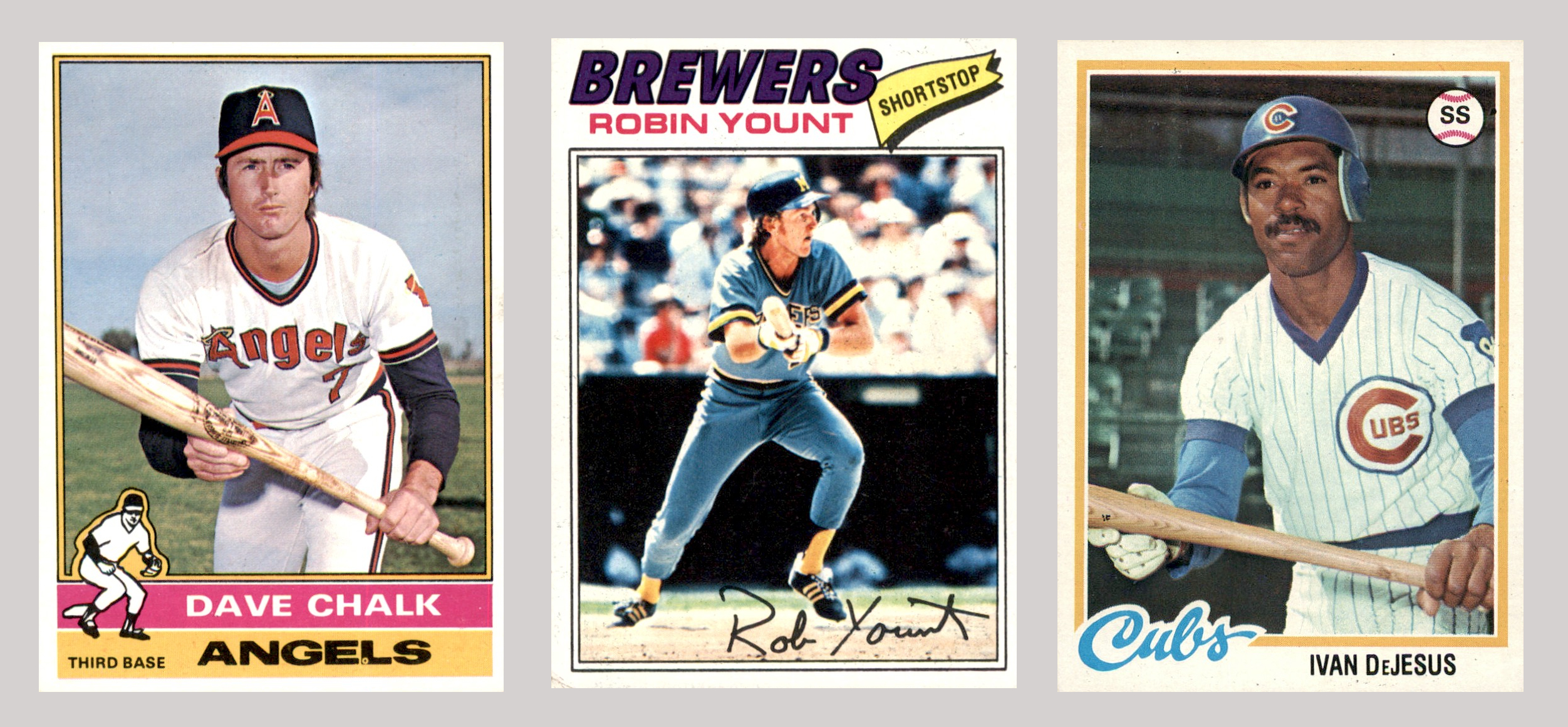
Dave Chalk (63) is pretty serious about bunting, Robin Yount (104) might have just executed one nicely, and Ivan de Jesus (87) shows us the batting-glove-on-right-hand-only method.


Mick Kelleher (35) is eager to bunt, Alan Trammel (124, led AL in 1981 and 1983) practices his craft in the batting cages, and Fred Lynn (25) is about to lay one down in a game. 


Rick Dempsey (63), Alex Trevino (27), and Alan Ashby (55) are all catchers, and they're all getting the job done on a sunny afternoon at the ballpark.


Kevin Bass (28) looks like he's squared around very early, letting everyone in the park know that he's going to bunt. Dick Schofield's (109) technique is not recommended, and Rick Burleson (84) is grinding hard to lay one down.


Pat Sheridan (25) just pushed one along the third base line, Randy Velarde (38) is about to try his luck at Yankee Stadium, and if you look closely at the Vince Coleman (48) card, you'll see that the ball has just left his bat and it seems to be headed in a good direction. I wonder if the speedster beat it out for a bunt single.
 
That's two and a half decades of bunting on cards. It's worth noting that other brands that got their start in the 1980s like Bowman, Donruss, Fleer, Score, and Upper Deck all featured some bunting players as well. And it's even nicer to know that they didn't stop there. You'll find players bunting on cards throughout the '90s, too, and even all the way to modern times!
 
"But the numbers and analytics show that bunting doesn't pay off." you say. "Why would modern cards show players bunting? It doesn't even happen in games anymore." you scoff.
 
Oh no? 
 
Take a look at these three. 


There's 2022 Yonathan Daza (8), 2023 Leody Taveras (9), and 2024 Nick Madrigal (8) showing that they can square around when needed.
 
And I do think bunting has been making a little bit of a comeback over the past couple of years. It's certainly an art and a skill. And a little bit of risk can lend excitement to the game. Look here. 


So how about you readers? 
 
Are you fans of bunting? Do you think the game could use more of it? Do you think it's been making a bit of a comeback lately? 
 
Leave some thoughts in the comment section. And thanks for reading!
 

Sunday, March 17, 2024

1976 Japanese Menko Eye Candy

 
Feast your eyes on this:


You're looking at Shigeru Takada of the Yomiuri Giants.
 
And that card he's on is a piece of eye candy.
 
It's from a 1976 set of Japanese cards that I came across a few years ago on Sean's blog, Getting Back into Baseball Cards . . . in Japan. I sure was thankful for it, and figured with 2024 Opening Day around the corner, it would be a good time to finally circulate it around the blogs again.
 
Look at the angle of those lines and how the Takada family name follows along. Add a strong hitter's follow-through, and the whole design makes it seem like Shigeru has just walloped a ball deep into left field. The flat, bright background colors only help the action stand out. (It also looks like there's a soft baseball cap tucked into his back pocket, which always adds some coolness points.)
 
It's just really good design. And remember, we're talking about a time when so much was done by hand. Imagine an illustrator sitting at a drawing table with a ruler, pencils, pens, inks, masking tape, and paints, and creating this beautiful piece of art—all for a little baseball card that kids might toss around or tack to their wall. 
 
Pretty special, isn't it?
 
If I had the actual card in my collection, this blog post would have been part of my Favorites Box series. But alas, I only have the digital image of the card. At least for now.
 
As for the man himself, Shigeru Takada had a very successful 13-year career with the Giants. The outfielder was the 1968 Central League rookie of the year, and played for many seasons alongside Sadaharu Oh. Here are some career numbers:
 
1512 games played, 1384 hits, 838 runs, 229 doubles, 32 triples, 139 home runs, 499 RBI, 200 stolen bases, .273/.339/.414. 
 
Takada also made multiple All-Star teams, took home multiple Diamond Glove awards, and helped the Giants to six championships.

And he's got a heck of a baseball card up there.
 
Thanks, Sean, for the inspiration. Here's to the new MLB (and NPB) season!
 

Sunday, April 23, 2023

1986 Topps Tattoos are Pop Art

Recently I came across a 1986 offering from Topps that I was not aware of back then:
 
Topps Tattoos.


Topps Tattoos?
 
Yes. Topps Tattoos. Turns out they were sold in wax packs, with one continuous folded sheet of 18 tattoos inside. (Plus a stick of gum.) After some additional research, it turns out Topps also released a tattoo product in 1960, 1964, and 1971.
 
If I'd seen these on shelves at the local stationery store or drug store when I was a kid back in 1986, I'm sure I would have asked my mom if I could have a pack or two. All these years later, I'm happy to have the panels pictured above in my collection.
 
I'm not going to apply any of the tattoos anywhere on my person, but here are the instructions anyway, straight from a wax wrapper:


Let's have another look at the panel of tattoos above and talk about the design, though, because I do appreciate it.
 
Does it remind you of any works from the pop art era? Roy Lichtenstein's brightly colored comic book–style works come to mind. As does Andy Warhol's work. The Campbell's soup cans. Marylin Monroe. Pete Rose. 


And so I thought it would be fun to do a little pop-art tribute using a couple of the baseball players on my sheet of tattoos. But which ones?
 
Pete Rose had already been featured in some actual pop art, so he was out. Scott McGregor had the Magnum P.I. mustache and Cecil Cooper was sporting the '80s dad beard—both solid options. But I had to go with Mookie Wilson as my first choice because he's the happiest baseball player of the group.
 
Just look at him smiling in all those primary and secondary colors and tell me you're not happy now, too. 


For the second choice I went with Bruce Bochte, because what better way to capture the 1980s than to feature that pair of eyeglasses four separate times?


It was a fun time to be a young baseball fan. Fun players. Fun products. And this was a fun little project.

Do any of you collectors remember Topps Tattoos? Do you have any in your collection? Share in the comment section, and thanks for reading, as always!
 

Sunday, December 22, 2019

Art Prints

The original version of Tron hit theaters when I was still just toddling around. Even as I grew into childhood, though, I wasn't much of a sci-fi/tech/computer kid. I didn't watch the film back then in the '80s, and although I've seen it since, the story line still doesn't do it for me all these years later.

The artwork, however? That's a different story.


A big reason I appreciate that portion of the franchise is that one of my favorite concept artists, Syd Mead, was a main contributor. Look at the colors and circuitry within the mainframe's world. Definitely look at the light cycles. Yep. Syd Mead.


And a few months ago I had the opportunity to pick up some prints that feature Mead's design work.

The shapes, the angles, the colors. There's 1980s goodness everywhere you look.


Now, these prints were made in 1982, the same year the film was released. I should also mention that each print is pretty small: 3.5 inches by 2.5 inches. And I should also mention that they were produced by a company called Donruss.

Okay, okay. They're trading cards.

Technically.


But just look at how cool they are.

And because an original art print from Syd Mead probably costs more than I'd like to spend, I'm going to consider these art prints. Is that alright?