Showing posts with label redesign. Show all posts

Sunday, February 23, 2025

1991-92 Bowman Hockey: A Redesign

Here's the word of the day at Nine Pockets:

gradient (noun): change in the value of a quantity (such as temperature, pressure, or concentration) with change in a given variable and especially per unit distance in a specified direction. 
 

From a design perspective, that "change in the value of a quantity . . . in a specified direction" also applies to color. 
 
It's interesting and science-y enough, but this is a trading card blog. So what in the world does it have to do with trading cards? And the 1991-92 Bowman hockey set?
 
Well, by the time the 1991-92 sporting season came along, the trading card industry was quite familiar with color gradients. Have a look at these three examples.
 
 
1987 Fleer, 1989 Donruss, and 1992 Fleer show their color gradient chops, vertically and horizontally

 
So it shouldn't be a surprise that the Bowman brand took their shot at it, too. Look here.


That dark purple-to-light-purple fade across the bottom is peculiar enough. But then you add the orange and light blue border around the rest of card, and it feels like maybe Bowman was borrowing from the popular southwestern design motifs of the early '90s. 


You could totally display some 1991-92 Bowman cards in a room like that.
 
And all of the cards in the set feature that same border design and color combination. It's not what I'd expect for a hockey card, but then again, if there was any era to find odd color combinations on cards, the early '90s was it. In fact, Bowman thought so much of the design that they used it for their baseball and football sets that year, too!


All that being said, when I was looking through the cards in Bowman's hockey set a few months ago, I paused for some reflection. As fitting as those colors were for the early '90s (and although there is something nice about having a set of cards with the same border design across the entire set), I thought the cards could use an update. So I got to work. 
 
Now I'm ready to show the results.
 
As I've done with other set redesigns, I selected one card from each team to work with. The choices were based on the photograph—it had to contain something that represented the sport well, or showed the uniform and team logo clearly.
 
Here we go, in alphabetical order, by city.


To go into more detail:
 
(1) Most teams have two main colors (aside from white and black), so I decided to use those team colors for the gradient bar and borders. I had to tinker with some teams more than others, but I like the result. For teams like Detroit and Toronto, which only have one main color, I added a neutral gray.
 
(2) In general, I like it when card fronts feature the player's position, or at least an abbreviation for the position. That little space on the left side of the gradient bar seemed like a perfect location to add the G, D, C, LW, or RW designation—almost like the folks at Bowman designed it that way. So I made use of the space.

(3) I went back and forth on adding a team logo to the card. First I tried placing the logo in a white circle, but it felt like way too many other card sets—even a couple from the same 1991-92 season, like O-Pee-Chee and Pro Set. Eventually I settled on a triangular "shield" type of shape. The downward-pointing direction matched up well with the upward-pointing triangle at the bottom left of the card. But in the end, I scrapped it altogether. The logo felt distracting.
 
And besides, that same year, Parkhurst only had a player name on the front. Stadium Club only had a player name on the front. And Pro Set Platinum didn't have anything on the front. No player name. No team logo. Just a full-bleed image and the Pro Set Platinum logo. So the lack of a team logo is fine here.

 
But wait, there's more.
 
In 1991, the San Jose Sharks became the first expansion team since the WHA–NHL merger in 1979. And although there weren't any official Sharks cards in the 1991-92 Bowman set, the company did add a "Now with Sharks" note to the cards of a few players who'd been claimed by San Jose in the expansion draft or traded to the team during the season. For some bonus content, I found one of those cards, did a little bit of airbrushing, and removed the "Now with Sharks" note.


This was the only Sharks card in the set that featured a headshot, and I'm thankful for that. Airbrushing a player's full uniform, or even their jersey, was something I didn't want to do. The collar of the jersey was enough.


But wait, there's still more.

Because this Bowman set is numbered and organized by team, I wanted to see how a 9-pocket page would look in the new design. I thought the Hartford redesign looked pretty nifty, and made that my experiment.

First, here are 9 of the team's cards in their original design.


It's really not so bad when you see it in the familiar 9-card layout. But I love those Hartford jerseys and colors. I needed to see the 9 cards in the new design. Here they are.


Ahh. That's the stuff.
 
And that 9-pocket page looked so sharp, I decided to do another team. Here's Vancouver in the original design.


Again, not bad by any means. But get a load of them in the new design.


I think that yellow-orange-black gradient is pretty sweet.


So that's the redesign. I had fun with this one, for sure. I think Vancouver, Hartford, Los Angeles, and Calgary are my favorites at the moment.

What are your thoughts? Which team looks the best? 
 
Do you think hockey card collectors would have opened more Bowman packs in 1991-92 if the cards were color matched like the ones above? 

Let me know in the comment section. And thanks for reading, as always.

Sunday, September 19, 2021

1991 Fleer Baseball: Expanded Redesign

A couple of months ago, I posted a preliminary redesign of what was originally a very yellow 1991 Fleer baseball card set. I say preliminary because by the end of that post I just couldn't decide which of two border color ideas I liked better: white or charcoal. So, I asked you, the readers, to contribute your thoughts.
 
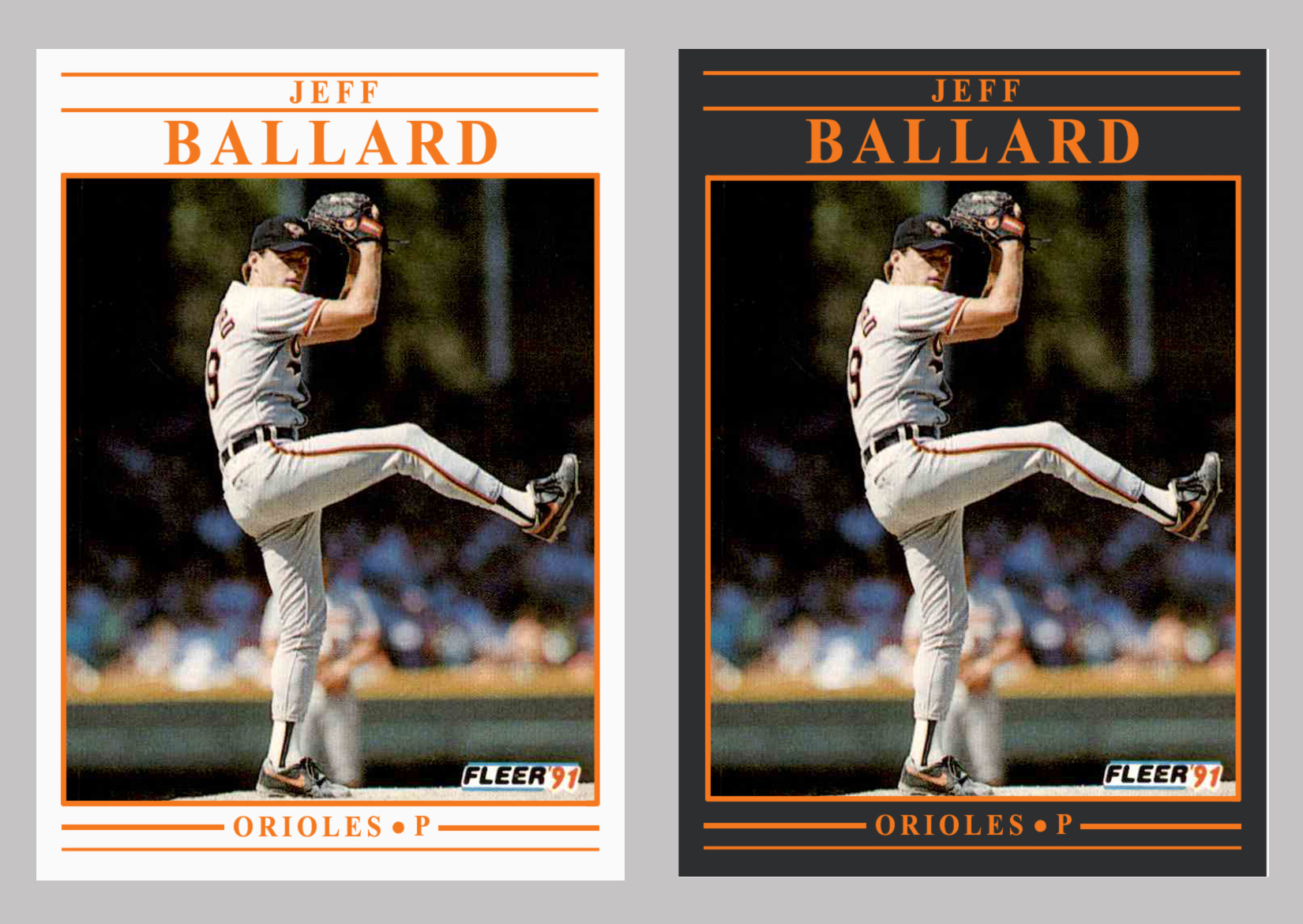
The comments were just about even between white and charcoal, so instead of choosing one border color or the other for the complete redesign, I figured I'd do both for each team. Bonus cards!

Just as with the 1992 Fleer redesign I did a while back, I tried to choose a card for each team that featured a well-framed shot, a good action shot, or otherwise interesting subject matter. As you'll see, I think the Fleer photographers captured some gems that season.  
 
First, here's a reminder of what the original cards look like. Jack Clark is wondering why so much yellow.


Now here's the redesign for each team, in alphabetical order by city name. 


I think I like some of the teams better in white (Brewers, Yankees, Phillies) and other teams in charcoal (Orioles, Athletics, Pirates). And then there are some teams that look fine either way (Pirates, Cardinals, Blue Jays). Ultimately, I enjoyed the project, and I hope you like the way the cards turned out.
 
Any favorites of the bunch? Did I do your team justice with the color and image choice? 

Share in the comment section, and thanks for reading.

Sunday, July 18, 2021

1991 Fleer Baseball: A Redesign

About a year ago I tried a redesign of the much-maligned 1992 Fleer Baseball set. It was a thoroughly enjoyable project, and the new design generated a lot of clicks and favorable comments. Some folks even went so far as to suggest that I try a redesign of another infamous set of the era:
 
1991 Fleer!
 
Jack Clark ponders the meaning of all this
yellowness and says he's staying in the dugout
 
 
It's remarkable to look back and realize that a year before 1992's sage green borders, Fleer went with an even more ostentatious bright yellow.
 
But it was the early 1990s. Card companies were pushing the envelope. Competition in the market was increasing. I say kudos to Fleer for taking that leap of boldenss (or lunacy) and trying something new. 
 
Still, many would agree that it would be good to give 1991 Fleer a new look. 
 
I started tinkering around, and figured I'd set a goal similar to last time: Try out a couple of different ideas on a handful of cards, choose which design I liked best, and then use that design to create one card for each MLB team.
 
To start off, here are six cards from the original set in all their yellowness.


And you know what? Similar to my thoughts on 1992 Fleer when I see them next to each other, nine-pocket style, I don't think the 1991 design is completely awful. But flipping through an entire binder of them, page after page? That might be a bit much.
 
So let's get on to the redesign ideas. 
 
First I thought white could work, so I gave it a try on the same six cards. 


Paired with a matching text color for each team, it's not bad. I'd call it clean. Light. Simple.
 
However, the overall design of 1991 Fleer is also simple. It's just a plain Times New Roman font and a few horizontal stripes. If you add an equally simple white border to that, maybe there's just not quite enough to it. 
 
Besides, Fleer used white borders in their baseball card design two out of the previous three years (1988 and 1990). By the time 1991 rolled around, designs of the new premium brands like Leaf and Stadium Club were starting to stand out. I'm not sure going with simple white borders yet again would have generated much more interest among collectors than the yellow borders did.
 
So the next thing I did was to go back to a similar charcoal color that I used for the gradient in the 1992 Fleer redesign. (Swapping out Cerone for Bonilla to show an example of a yellow version.)


I like this one more. It's sharp. It's a little more elevated. The colors really stand out against the charcoal. I think a lot of kids would have been psyched to find these cards inside their Fleer wax packs in 1991.
 
However, I'm also a little bit hesitant with this one. Is it too much of a premium look for Fleer's flagship set? Remember, they debuted their own premium brand, called Ultra, in 1991. Ultra's card backs that year were indeed premium, with lots of color, not to mention three (THREE!) additional images of the player who was featured on the front. But the card fronts were a bit bland, with a very neutral and thin silver border running across the top and bottom of the card.  


How could the card fronts on Fleer's flagship set look more premium than the fronts on their premium set?

I'm sure I'm thinking too much about this. I like the charcoal borders better, so why not just create a card for each team using the charcoal design?
 
Well, it's because now that I look back at the white borders, I'm kind of liking them more and more. And there's my conundrum. I'm still not sure which design I want to use on all 26 teams. 
 
Maybe it's time to ask you, the readers.

Which design do you like more, white borders or charcoal borders? 
 
Or maybe I should do something different, like set American League teams in the white border and National League teams in the charcoal border? (Or vice versa?)
 
Leave a comment and we'll go from there.

Thanks for reading, as always. I look forward to your answers!