A year ago, I sent out a particular trade package with the intention that the bubble mailer (and packing supplies within) be reused as many times as possible, giving it the chance to visit as many bloggers and collectors as possible.
Here's a list of bloggers who've received and sent out the envelope, at least to my knowledge, along with a link to their blog entry showing the cards they received and the cards they proceeded to send out to the next recipient. (Please add a note in the comment section if I missed your stop.)
4/11/19 (Oregon): Gavin from Baseball Card Breakdown
4/29/19 (Ontario, Canada): Angus from Dawg Day Cards
8/7/19 (Rhode Island): Shane from Shoebox Legends
8/14/19 (New Jersey): Chris from The Collector
8/22/19 (Ohio): Adam from Cardboard Clubhouse
1/24/20 (Illinois): Nick from Dime Boxes
Then Nick sent the envelope to Greg from Night Owl Cards (New York), and I believe Greg sent it on to the next collector, but that's where my trail stops.
Regardless, that makes eight collectors. Pretty cool!
What's even more cool? Over this past year I've realized that many collectors already do make it a practice to reuse envelopes, as well as supplies like top loaders, team bags, and nine-pocket pages, when sending out cards. Nice going, everyone!
But what does that mean for this particular well-traveled envelope, especially with the current epidemic out there?
The original idea was that I'd compile its travels at the one-year mark and see if it would be worth tracking for another year. It's understandable if some folks would rather hold off on receiving mail for a while, but for those who want to keep the cards moving, I'd say by all means, keep sending it around (safely), adding your info to the sheet (safely), and posting about it on your blogs (have you wiped down your keyboards and phones lately?). In your post, feel free to list the States or countries it's already visited.
Most importantly, keep making all your envelopes well traveled by reusing as much material as you can (safely). It's good for the environment and good for your wallet.
If you haven't yet received the well-traveled envelope but would like to participate, feel free to comment below. That might give the current envelope holder an idea of who to send it to.
So, where will the envelope visit next? How banged up has it gotten? What cards will it contain? Hopefully we'll have many more installments over this next calendar year.
Thanks for reading. (And participating!) And stay safe, wherever you might be.

Sunday, April 12, 2020

Sunday, April 5, 2020
Best Nine-Pocket Page from a Completed Set
Back in October, the Five-Tool Collector posted some attractive cards from his 1957 Topps baseball set build. He mentioned how the smaller size of the set lent itself to high quantities of star power on each binder page, and wrapped up a particular paragraph by saying, "For me there is nothing like flipping through a set and just seeing stars on top of stars."
I fully agree.
Interestingly, around that same time I was putting together a set of 1984-85 Topps hockey cards, and I too had one of those star-studded experiences. It happened as I turned to the sixth page, card numbers 46–54. Here they are:

I think this might be the best nine-pocket page from any set in my collection. (Aside from the obvious pages that contain a bunch of all-star subset cards.) Here's why.
First, the players:
#46 John Ogrodnick – 928 NHL games played; 827 points; All-Star game; scored 100 points in a season; led the 1984-85 Detroit Red Wings in scoring (105 points) and the 1989-90 New York Rangers in scoring (74 points).
#47 Brad Park – Hall of Fame (1988); 1,113 NHL games played; 896 points; 9 All-Star games; member of Team Canada during the 1972 Summit Series.
#48 Greg Stefan – Nine-year NHL career; won 20 games in a season three times.
#49 Steve Yzerman – Hall of Fame (2008); three-time Stanley Cup winner; 1,514 NHL games played; 1,755 points; 9 All-Star games; Olympic Gold Medal (Canada 2002); Conn Smythe, Selke, Masterton, and Pearson trophy winner.
#50 Paul Coffey – Hall of Fame (2004); four-time Stanley Cup winner; 1,409 NHL games played; 1,531 points; 14 All-Star games; three-time Norris trophy winner.
#51 Wayne Gretzky – WAYNE GRETZKY.
#52 Jari Kurri – Hall of Fame (2001); five-time Stanley Cup winner; 1,251 NHL games played; 1,398 points; 9 All-Star games; Olympic Bronze Medal (Finland 1998); Lady Byng trophy winner.
#53 Bob Crawford – Seven-year NHL career; scored a career-best 36 goals in 1983-84.
#54 Ron Francis – Hall of Fame (2007); two-time Stanley Cup winner; 1,731 NHL games played; 1,798 points; 4 All-Star games; Lady Byng, Selke, and Clancy trophy winner; more career assists than any NHL player not named Wayne Gretzky.
To summarize, that's 6 out of 9 players in the Hall of Fame, 18 Stanley Cups, a few team captains, 7 out of 9 all-stars, and too many points, records, and awards to count.
Above all that, these nine players shake out well when it comes to icing a team by position:
Centers (3) – Gretzky, Yzerman, Francis (how's that for your top three centers??)
Left Wings (1) – Ogrodnick
Right Wings (2) – Kurri, Crawford
Defensemen (2) – Coffey, Park
Goalies (1) – Stefan
Yes. I do believe you could build a team around those nine players.
I also thought this would be a fun opportunity for all of you bloggers and collectors to flip through some binders you haven't flipped through in a long time and find some star-studded pages of your own.
So, what's the best nine-pocket page from a set in your collection? It can be any sport.
I hope you'll give it a try, and even share your findings!
I fully agree.
Interestingly, around that same time I was putting together a set of 1984-85 Topps hockey cards, and I too had one of those star-studded experiences. It happened as I turned to the sixth page, card numbers 46–54. Here they are:

I think this might be the best nine-pocket page from any set in my collection. (Aside from the obvious pages that contain a bunch of all-star subset cards.) Here's why.
First, the players:
#46 John Ogrodnick – 928 NHL games played; 827 points; All-Star game; scored 100 points in a season; led the 1984-85 Detroit Red Wings in scoring (105 points) and the 1989-90 New York Rangers in scoring (74 points).
#47 Brad Park – Hall of Fame (1988); 1,113 NHL games played; 896 points; 9 All-Star games; member of Team Canada during the 1972 Summit Series.
#48 Greg Stefan – Nine-year NHL career; won 20 games in a season three times.
#49 Steve Yzerman – Hall of Fame (2008); three-time Stanley Cup winner; 1,514 NHL games played; 1,755 points; 9 All-Star games; Olympic Gold Medal (Canada 2002); Conn Smythe, Selke, Masterton, and Pearson trophy winner.
#50 Paul Coffey – Hall of Fame (2004); four-time Stanley Cup winner; 1,409 NHL games played; 1,531 points; 14 All-Star games; three-time Norris trophy winner.
#51 Wayne Gretzky – WAYNE GRETZKY.
#52 Jari Kurri – Hall of Fame (2001); five-time Stanley Cup winner; 1,251 NHL games played; 1,398 points; 9 All-Star games; Olympic Bronze Medal (Finland 1998); Lady Byng trophy winner.
#53 Bob Crawford – Seven-year NHL career; scored a career-best 36 goals in 1983-84.
#54 Ron Francis – Hall of Fame (2007); two-time Stanley Cup winner; 1,731 NHL games played; 1,798 points; 4 All-Star games; Lady Byng, Selke, and Clancy trophy winner; more career assists than any NHL player not named Wayne Gretzky.
To summarize, that's 6 out of 9 players in the Hall of Fame, 18 Stanley Cups, a few team captains, 7 out of 9 all-stars, and too many points, records, and awards to count.
Above all that, these nine players shake out well when it comes to icing a team by position:
Centers (3) – Gretzky, Yzerman, Francis (how's that for your top three centers??)
Left Wings (1) – Ogrodnick
Right Wings (2) – Kurri, Crawford
Defensemen (2) – Coffey, Park
Goalies (1) – Stefan
Yes. I do believe you could build a team around those nine players.
I also thought this would be a fun opportunity for all of you bloggers and collectors to flip through some binders you haven't flipped through in a long time and find some star-studded pages of your own.
So, what's the best nine-pocket page from a set in your collection? It can be any sport.
I hope you'll give it a try, and even share your findings!
Sunday, March 29, 2020
Pitching Pose Perpetrators
Look through any stack of baseball cards from the '50s, '60s, or '70s and you'll find scores of classic baseball poses. For position players you have the batting stance, the fielding stance, the bunting pose, and the bat on shoulder, to name a few. And for pitchers, there's the "hands over head" wind-up pose.
So classic and time-honored is this pose that throughout the decades you'll find cup-of-coffee pitchers, journeyman pitchers, all-stars, and even Hall-of-Famers putting their stamp on it.
But something is a little fishy in Pitcherville. And if you look closely at some of the images, you're bound to notice it:
The absence of a baseball in that pitching hand.
At first you might think, Okay, they're just posing for a baseball card, so it's fine.
But then you think about it some more:
They're on a baseball field, for crying out loud! Surely there's a baseball nearby.
So what gives?
Well, first let's note that there were pitchers who at least put forth the effort to hide their pitching hand and make things look authentic.
Sometimes they'd do it by turning the back of their glove to you.
Good job there, Mel.
If they really wanted to be careful, they'd pull that glove wayyy behind their head and look innocently away from the camera, like Mike Paul here.
And Doyle Alexander was so smart that he simply made sure his wind-up finished out of camera range.
But it's important now to provide a sampling of the miscreants—the brash guys who simply didn't care about committing pitching pose fraud. This activity was so prevalent that I had no problem finding a representative example from 15 straight years of Topps cards. You can find even more examples on your own.
But don't despair. Not all pitchers are such scofflaws. There were a few good eggs out there who, before taking their pose, thought about the impressionable, bubble gum-chewing, card-collecting kids out there, looked around for a teammate, and said, "Hey, toss me a ball, will ya?"
(Thanks to the internet for providing me with many of these images)
 |
| 1978 Topps #400, Nolan Ryan |
So classic and time-honored is this pose that throughout the decades you'll find cup-of-coffee pitchers, journeyman pitchers, all-stars, and even Hall-of-Famers putting their stamp on it.
But something is a little fishy in Pitcherville. And if you look closely at some of the images, you're bound to notice it:
 |
| 1968 Topps #139, Chris Short |
The absence of a baseball in that pitching hand.
At first you might think, Okay, they're just posing for a baseball card, so it's fine.
But then you think about it some more:
They're on a baseball field, for crying out loud! Surely there's a baseball nearby.
So what gives?
Well, first let's note that there were pitchers who at least put forth the effort to hide their pitching hand and make things look authentic.
Sometimes they'd do it by turning the back of their glove to you.
 |
| 1966 Topps #350, Mel Stottlemyre |
Good job there, Mel.
If they really wanted to be careful, they'd pull that glove wayyy behind their head and look innocently away from the camera, like Mike Paul here.
 |
| 1970 Topps #582, Mike Paul |
And Doyle Alexander was so smart that he simply made sure his wind-up finished out of camera range.
 |
| 1979 Topps #442, Doyle Alexander |
But it's important now to provide a sampling of the miscreants—the brash guys who simply didn't care about committing pitching pose fraud. This activity was so prevalent that I had no problem finding a representative example from 15 straight years of Topps cards. You can find even more examples on your own.
 |
| 1965 Topps #174, Joe Jay |
Joe Jay, clearly guilty.
 |
| 1966 Topps #12, John Tsitouris |
John Tsitouris almost hid it well enough. But no.
 |
| 1967 Topps #221, Woody Fryman |
An All-Star Rookie should do better than that, Mr. Fryman.
 |
| 1968 Topps #324, Jim Nash |
Jim Nash, that airbrushed baseball cap isn't distracting us from the truth.
 |
| 1969 Topps #599, John Boozer |
John Boozer. I mean. . .
 |
| 1970 Topps #77, Frank Linzy |
Frank Linzy, you've got to try harder.
 |
| 1971 Topps #631, Eddie Fisher |
Eddie Fisher, not good enough.
 |
| 1972 Topps #84, Vince Colbert |
Come on, Vince.
 |
| 1973 Topps #411, Ray Corbin |
Ray Corbin can't fool us.
 |
| 1974 Topps #37, Dave Sells |
Dave Sells: Inconclusive, but suspicious.
 |
| 1975 Topps #428, Dave Hamilton |
Dave Hamilton couldn't be much more obvious.
 |
| 1976 Topps #51, Ray Burris |
Ray Burris? Not trying.
 |
| 1977 Topps #28, Woodie Fryman |
Woodie Fryman, this is your second offense (see 1967 card above).
Changing your name from "Woody" to "Woodie" didn't fool anyone.
And this time you have disgraced Les Expos and all of Canada.
Changing your name from "Woody" to "Woodie" didn't fool anyone.
And this time you have disgraced Les Expos and all of Canada.
 |
| 1978 Topps #233, Dick Pole |
Dick Pole. Guilty.
 |
| 1979 Topps #437, Rick Williams |
On your rookie card, Rick? For shame.
But don't despair. Not all pitchers are such scofflaws. There were a few good eggs out there who, before taking their pose, thought about the impressionable, bubble gum-chewing, card-collecting kids out there, looked around for a teammate, and said, "Hey, toss me a ball, will ya?"
 |
| 1957 Topps #21, Frank Sullivan |
Atta boy, Frank.
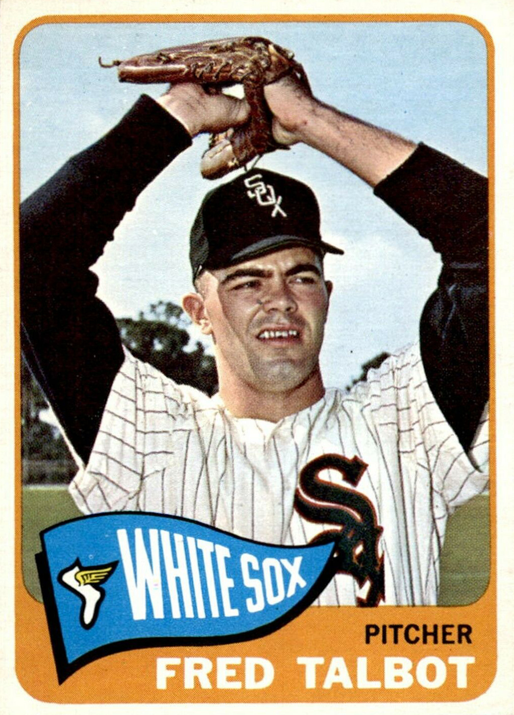 |
| 1965 Topps #58, Fred Talbot |
Well done there, Fred.
 |
| 1966 Topps #97, Jim Merritt |
Jim went with a used baseball for extra realism.
 |
| 1977 Topps #144, Bruce Sutter |
That's the way, rookie.
Lookin' good, Gary.
 |
| 1978 Topps #596, Gary Wheelock |
Lookin' good, Gary.
 |
| 1980 Topps #243, Jerry Augustine |
Jerry Augustine, leading the way into the 1980s.
 |
| 1982 Fleer #27, Fernando Valenzuela |
Fernando's got a baseball in that left hand. And he's smiling because it feels good to do the right thing.
For all you young pitchers out there who aspire to have your image captured on cardboard one day, do the right thing, too.
For all you young pitchers out there who aspire to have your image captured on cardboard one day, do the right thing, too.
(Thanks to the internet for providing me with many of these images)
Sunday, March 22, 2020
Guardian Angel of the Long Ball
Our blogger friend Sean, who's getting back into baseball cards in Japan, showed us a few cards from the 1975 "Rocket Robots" menko set last month. If you happened to read that post, I'm wondering what sort of reaction you had when you saw this card of Sadaharu Oh.

Sean referred to it as "striking", which fits the bill perfectly.
It's the background that really does it for me. Those energetic white dots and streaks seem to be an abstract, artistic way of representing rays of the yellow sun behind him. Or maybe that sun is meant to symbolize something else, as Sean suggested:
The background artwork makes it look like he has a halo. Saint Oh, guardian angel of the long ball. . .
Well, after reading that line, inspiration struck, and it struck to the point that I put aside some of the other design projects I was working on and set right out to create a more saintly, stained glass version of the card. Here it is.

The idea for a stained glass baseball card isn't new. They've appeared in sets as far back as 1996, from what I can tell. But the notion is still excellent. After all, for some fans, baseball is a religion.
And if those folks were to enter their places of baseball worship, you can imagine they'd feel a sense of comfort and strength as they gazed up toward Sadaharu Oh, guardian angel of the long ball. Or perhaps they'd refer to him as the patron saint of the long ball.
Just look. There he is, with baseball's version of a sword held at the ready. His eyes describe a studious, wary focus—evidence that he understands the weightiness of his position. And who better to uphold that position than the career home run leader in Nippon Professional Baseball history? (He retired in 1980 with 868 home runs, and still holds the lead by more than 200.)
Additionally, he remained with the same team—the Yomiuri Giants—for his entire playing career. Loyalty. Another saintly quality. With Sadaharu Oh, inspiration abounds.
Thank you for providing some for me, Sean.
And thanks for reading, everyone.

Sean referred to it as "striking", which fits the bill perfectly.
It's the background that really does it for me. Those energetic white dots and streaks seem to be an abstract, artistic way of representing rays of the yellow sun behind him. Or maybe that sun is meant to symbolize something else, as Sean suggested:
The background artwork makes it look like he has a halo. Saint Oh, guardian angel of the long ball. . .
Well, after reading that line, inspiration struck, and it struck to the point that I put aside some of the other design projects I was working on and set right out to create a more saintly, stained glass version of the card. Here it is.

The idea for a stained glass baseball card isn't new. They've appeared in sets as far back as 1996, from what I can tell. But the notion is still excellent. After all, for some fans, baseball is a religion.
And if those folks were to enter their places of baseball worship, you can imagine they'd feel a sense of comfort and strength as they gazed up toward Sadaharu Oh, guardian angel of the long ball. Or perhaps they'd refer to him as the patron saint of the long ball.
Just look. There he is, with baseball's version of a sword held at the ready. His eyes describe a studious, wary focus—evidence that he understands the weightiness of his position. And who better to uphold that position than the career home run leader in Nippon Professional Baseball history? (He retired in 1980 with 868 home runs, and still holds the lead by more than 200.)
Additionally, he remained with the same team—the Yomiuri Giants—for his entire playing career. Loyalty. Another saintly quality. With Sadaharu Oh, inspiration abounds.
Thank you for providing some for me, Sean.
And thanks for reading, everyone.
Sunday, March 15, 2020
The 1982-83 O-Pee-Chee Dating Game (Episode 9)

Welcome back to The 1982-83 O-Pee-Chee Dating Game, where we'll randomly select three eligible bachelors from the set and you, the reader, will choose which one wins that date with a special lady. How do we know they're bachelors? Why, it says so right on the back of their hockey cards, that's how!
Previous episodes are available here.
Episode 8 ended in a tie between Keith Brown and Brad Palmer. You can still go back and vote to help break the tie!
Now let's start the 9th round and introduce the bachelors chosen by the randomizer! [APPLAUSE]
And folks, we've got a pretty special episode tonight. There's electricity in the air, and young ladies have been swarming the studio since early this morning. Let's introduce the bachelors and find out why.
Bachelor number 1: Left wing from the New Jersey Devils, Paul Gagne
Bachelor number 2: Center from the Edmonton Oilers, Wayne Gretzky

OWWWWW! WAYNE! OVER HERE! WOOOOOOO! WE LOVE YOU! YOWWWW!
Okay, thank you. Thank you ladies, thank you. Okay. We've still got one more bachelor to introduce, now. Thank you.
Bachelor number 3: Left Wing from the Chicago Black Hawks, Al Secord

Now let's find out more about these bachelors from the back of their cards.


You see, ladies? You made such a scene that Wayne got a little bashful and just couldn't think of anything interesting to share with us. But we've got to start voting. Who will the winner be this week?
Bachelor number 1: Former Spitfire Paul Gagne, who set a record as the youngest player in the NHL just a couple of years ago.
Bachelor number 2: Wayne Gretz...

WAYNE! OVER HERE! OWWW! YOWWWW!
Bachelor number 3: Boxing man Al Secord.
Sunday, March 8, 2020
1992 Fleer Baseball: A Redesign
 |
| Tim Hulett tries to escape the green borders |
The 1992 Fleer baseball card design raises a few immediate questions, doesn't it?
More than anything, it's those green borders. (Why green?) Folks will also point to the odd color gradient that runs from top to bottom. Then there's a small horizontal first name stacked on top of a big last name that's rotated 90 degrees. And that leads to a reduced amount of space for the player image.
What's interesting is that over the years it seems like many collectors have softened on the design—myself included. Back then I didn't like it at all. I was in my early adolescence and losing interest in collecting, so this set didn't exactly help rekindle anything. Fast-forward two or three decades, though, and I think '92 Fleer fits quite well in its time.
And to be fair, there are some attractive elements. I like how some of the players overlap the green border, producing a 3D effect. (See Mr. Hulett's left foot up there.) And some of the images are well done and show good baseball action.
However, I think it can be better. That's where this redesign post comes in.
It's the green color that I wanted to change most, so I tested out a bunch of different options and ended up with a few that were feasible. After a bit more pondering and narrowing down, I found two colors that I thought were real hits: A blue-gray (let's call it "slate"), and a more standard dark gray (let's call it "charcoal"). Then I applied those colors to some of my favorite cards in the set. I'll show those here.
Let's start with the first redesign: Slate.
Have a look at Bob Geren, Orel Hershiser, and Ryne Sandberg in their original greens:

They're really not terrible, right? In fact, seeing the cards side-by-side like this makes me appreciate the big letters for the last names a bit more. I like how they stand out.
But now have a look at the redesign:

Spiffy.
Let's do the same with three more cards, this time showing how Fleer used different colors for the player names, depending on the team.

Again, not so bad. But the redesign:

Let's move to the second color choice: Charcoal.
Here are three more cards from the set that I like, shown with the original green borders:

Now here they are in charcoal:

Here are three more, showing some different text colors again:

And here's the redesign:

I find it interesting that on the redesign some colors are difficult to read at just the right spot of the gradient. For example, look at the second "E" in Henderson, or the "Y" in Griffey. They're just the right shade to blend into the background, or fool the eye. That sort of thing doesn't seem to happen as much on the original green borders, even with Rickey's green-on-green. Maybe that's another reason Fleer chose that color.
Overall, I really enjoyed this exercise. Along with re-tooling the original design, it was fun to simply go back and flip through the cards in this set. And after putting forth the redesign effort, it does seem like there was some method to Fleer's madness back then.
So what do you think? Original greens? Slate? Charcoal?
Leave a comment below.
Sunday, March 1, 2020
The Crusher
Last year I picked up the first wrestling card in my collection, and mentioned that I wasn't sure how much larger the collection would get.
Well, I just acquired wrestling card #2, so my collection has now doubled in size!
Here it is:
How do you even begin describing the '90s coolness factor with this one?
The first thing I notice is the shades. Wow. Then there's all the neon. And the hat. And the background that resembles the background from every single 1990s high school yearbook in existence.
Get past that, however, and you'll also see a classic menacing wrestler's pose. Just look. Those hands are ready to clamp down and grapple with you. Do you stand a chance? No. No you don't. (I wonder if Randy learned that pose from his father Angelo, who was a tremendous professional wrestler himself.)
In a funny way, the pose also reminds me of another wrestler. His name is The Crusher.

That's him on the right. (Don't worry. Bugs Bunny took care of him.)
Returning to the card, though, here's the back:

Notice how the information is printed in both English and French. That's because this card is from a set that was only available in Canada. And if the name Swanson sounds familiar, you're onto something. In 1991 you'd find two of these wrestling cards packed inside select Swanson TV dinners (available in your grocer's freezer).
Here's the complete 12-card checklist:
1 Jake The Snake Roberts
2 Bret Hit Man Hart
3 Bushwhackers
4 The Mountie
5 Million Dollar Man Ted DiBiase
6 Ultimate Warrior
7 Hulk Hogan
8 Texas Tornado
9 Rockers
10 Legion of Doom
11 Big Boss Man
12 Macho Man Randy Savage
So, if you grew up in Canada back then and really liked the WWF, you may have begged your mom or dad to buy Swanson TV dinners every week until you had the complete set. Or at least until you found your favorite wrestler.
I'm happy to have this card in my collection now, along with the Hulkster. Talk about two monuments of professional wrestling. To quote Randy Savage himself,
Oh yeaaaaaah!
Well, I just acquired wrestling card #2, so my collection has now doubled in size!
Here it is:
 |
| 1991 Swanson WWF #12, Macho Man Randy Savage |
How do you even begin describing the '90s coolness factor with this one?
The first thing I notice is the shades. Wow. Then there's all the neon. And the hat. And the background that resembles the background from every single 1990s high school yearbook in existence.
Get past that, however, and you'll also see a classic menacing wrestler's pose. Just look. Those hands are ready to clamp down and grapple with you. Do you stand a chance? No. No you don't. (I wonder if Randy learned that pose from his father Angelo, who was a tremendous professional wrestler himself.)
In a funny way, the pose also reminds me of another wrestler. His name is The Crusher.

That's him on the right. (Don't worry. Bugs Bunny took care of him.)
Returning to the card, though, here's the back:

Notice how the information is printed in both English and French. That's because this card is from a set that was only available in Canada. And if the name Swanson sounds familiar, you're onto something. In 1991 you'd find two of these wrestling cards packed inside select Swanson TV dinners (available in your grocer's freezer).
Here's the complete 12-card checklist:
1 Jake The Snake Roberts
2 Bret Hit Man Hart
3 Bushwhackers
4 The Mountie
5 Million Dollar Man Ted DiBiase
6 Ultimate Warrior
7 Hulk Hogan
8 Texas Tornado
9 Rockers
10 Legion of Doom
11 Big Boss Man
12 Macho Man Randy Savage
So, if you grew up in Canada back then and really liked the WWF, you may have begged your mom or dad to buy Swanson TV dinners every week until you had the complete set. Or at least until you found your favorite wrestler.
I'm happy to have this card in my collection now, along with the Hulkster. Talk about two monuments of professional wrestling. To quote Randy Savage himself,
Oh yeaaaaaah!
Subscribe to:
Posts (Atom)