Sunday, July 25, 2021

Punch Buggy!

Back when I was a kid in the 1980s, Volkswagen Beetles were still rather prevalent on the roads. And why wouldn't they be? Aside from being affordable and giving you decent miles per gallon, they were fun to drive, iconic, and eye catching. And remarkably, after more than 40 years of production and assembly worldwide, new Beetles were still being produced in a factory in Mexico.  
 
Of all those qualifications, though, it was the eye-catching part that got to us kids. 
 
 
PUNCH BUGGY GREEN!
 
First, it was the size and shape. Beetles were unlike any other car out there.


PUNCH BUGGY ORANGE!
 
Then it was the sound. Those engines (50 horsepower, wow!) sounded like nothing else. On a quiet summer day you could easily hear a Beetle coming down the street.


PUNCH BUGGY SILVER!
 
And of course there were the colors. Beetles seemed to come in all variations. (I think my grandparents had an orange one. And before that a blue one.) 


PUNCH BUGGY PURPLE!
 
If you've been punched four times already and you're not sure why, well, that stinks for you. Tough luck. You were too slow. But let me explain.

Back then, we used to play a game called "punch buggy". This game had no time limit. And there was no starting point. I don't think anyone ever said, "Let's play the punch buggy game". It was just assumed. And perpetual. And as such, you always had to be ready. 
 
Punch or be punched.
 
If your mind was elsewhere, you didn't feel like playing, or you just didn't care, you also had to accept the fact that you might, at any time, take a hit.


PUNCH BUGGY YELLOW!
 
The rules were simple. Be the first kid to see a Beetle, and you could yell out "punch buggy!", followed by its paint color, and punch the kid next to you in the arm. (In some regions, I've heard the exclamation was "Slug Bug!")


SLUG BUG BLACK!
 
The Beetle in question could have been in motion, or it could have been parked on the street, in a driveway, or in a parking lot. The way we played, the Beetle could have even simply been on a billboard or on TV.


PUNCH BUGGY BLUE, CONVERTIBLE!
 
During back-seat car rides, punching suspense was raised to the maximum, as you knew you couldn't simultaneously look out every window of the vehicle. If your sibling or friend sitting next to you happened to see a Beetle on their side of the car, you were finished. They'd call out the color and hit you, and while the pain was still registering in your arm you'd have to quickly strain your neck and look around to confirm that they'd indeed seen the Beetle they claimed. After that, there'd be nothing to do but lick your wounds, heighten your awareness, ready your fist, and hope the next Beetle would zoom past your side of the car.


PUNCH BUGGY WHITE!
 
Now of course there were times when no one was thinking about the game. You could have been busy talking to the other kids about any number of things. You could have been tired. You could have been daydreaming. You could have been opening packs of baseball cards. But if a Beetle happened to appear, you'd suddenly find yourself in a reflex action, yelling out and punching the kid next to you. That's just how it was.


PUNCH BUGGY RED!
 
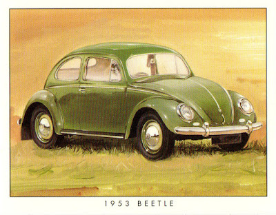
The cards you've seen throughout this post are from two little seven-card VW Beetle sets released in 1999 by a British printing company called Golden Era. The first set covers a few models from 1949 through 1966. The second set does the same for the years 1967 through 1980.
 
Note the slightly squatter size compared with a standard 2.5 x 3.5-inch trading card. These Beetle cards measure about 2.5 x 3.1 inches.
 
The artwork on the front of each card is pretty sharp, as are the write-ups on the back.
 

Altogether, both sets put me back about $12 including shipping, and for the dose of nostalgia they've given me, it's a win for sure.

Did any of you readers play the punch buggy game during your childhoods? Do kids today play the same game with the new versions of the Beetle? Have any of you seen a classic Beetle on the road lately? (Billy from Carboard History, I'm looking at you.)

Share some experiences in the comment section, and thanks for reading.

Sunday, July 18, 2021

1991 Fleer Baseball: A Redesign

About a year ago I tried a redesign of the much-maligned 1992 Fleer Baseball set. It was a thoroughly enjoyable project, and the new design generated a lot of clicks and favorable comments. Some folks even went so far as to suggest that I try a redesign of another infamous set of the era:
 
1991 Fleer!
 
Jack Clark ponders the meaning of all this
yellowness and says he's staying in the dugout
 
 
It's remarkable to look back and realize that a year before 1992's sage green borders, Fleer went with an even more ostentatious bright yellow.
 
But it was the early 1990s. Card companies were pushing the envelope. Competition in the market was increasing. I say kudos to Fleer for taking that leap of boldenss (or lunacy) and trying something new. 
 
Still, many would agree that it would be good to give 1991 Fleer a new look. 
 
I started tinkering around, and figured I'd set a goal similar to last time: Try out a couple of different ideas on a handful of cards, choose which design I liked best, and then use that design to create one card for each MLB team.
 
To start off, here are six cards from the original set in all their yellowness.


And you know what? Similar to my thoughts on 1992 Fleer when I see them next to each other, nine-pocket style, I don't think the 1991 design is completely awful. But flipping through an entire binder of them, page after page? That might be a bit much.
 
So let's get on to the redesign ideas. 
 
First I thought white could work, so I gave it a try on the same six cards. 


Paired with a matching text color for each team, it's not bad. I'd call it clean. Light. Simple.
 
However, the overall design of 1991 Fleer is also simple. It's just a plain Times New Roman font and a few horizontal stripes. If you add an equally simple white border to that, maybe there's just not quite enough to it. 
 
Besides, Fleer used white borders in their baseball card design two out of the previous three years (1988 and 1990). By the time 1991 rolled around, designs of the new premium brands like Leaf and Stadium Club were starting to stand out. I'm not sure going with simple white borders yet again would have generated much more interest among collectors than the yellow borders did.
 
So the next thing I did was to go back to a similar charcoal color that I used for the gradient in the 1992 Fleer redesign. (Swapping out Cerone for Bonilla to show an example of a yellow version.)


I like this one more. It's sharp. It's a little more elevated. The colors really stand out against the charcoal. I think a lot of kids would have been psyched to find these cards inside their Fleer wax packs in 1991.
 
However, I'm also a little bit hesitant with this one. Is it too much of a premium look for Fleer's flagship set? Remember, they debuted their own premium brand, called Ultra, in 1991. Ultra's card backs that year were indeed premium, with lots of color, not to mention three (THREE!) additional images of the player who was featured on the front. But the card fronts were a bit bland, with a very neutral and thin silver border running across the top and bottom of the card.  


How could the card fronts on Fleer's flagship set look more premium than the fronts on their premium set?

I'm sure I'm thinking too much about this. I like the charcoal borders better, so why not just create a card for each team using the charcoal design?
 
Well, it's because now that I look back at the white borders, I'm kind of liking them more and more. And there's my conundrum. I'm still not sure which design I want to use on all 26 teams. 
 
Maybe it's time to ask you, the readers.

Which design do you like more, white borders or charcoal borders? 
 
Or maybe I should do something different, like set American League teams in the white border and National League teams in the charcoal border? (Or vice versa?)
 
Leave a comment and we'll go from there.

Thanks for reading, as always. I look forward to your answers!

Sunday, July 11, 2021

The 1982-83 O-Pee-Chee Dating Game (Episode 18)


Welcome back to The 1982-83 O-Pee-Chee Dating Game, where we'll randomly select three eligible bachelors from the set and you, the reader, will choose which one wins that date with a special lady. How do we know they're bachelors? Why, it says so right on the back of their hockey cards, that's how!

Previous episodes are available here.

Episode 17 is currently stuck in a tie between Brent Sutter and Mike Foligno. Feel free to go back and cast a vote so we can break the tie.

Now, let's start the 18th round and introduce the bachelors chosen by the randomizer! [APPLAUSE]
 
Bachelor number 1: Center/Right wing from the Washington Capitals, Chris Valentine
Bachelor number 2: Defenseman from the New York Rangers, Barry Beck
Bachelor number 3: Center from the Los Angeles Kings, Doug Smith


We've got a couple of nice haircuts here, folks! Let's find out more about all three gents from the back of their cards.


We haven't had such bashful bachelors in quite some time! But our nice young lady this week still looks forward to the results, so get your votes in now. Who will it be?
 
Bachelor number 1: The appropriately named Chris Valentine, who scored a whopping 142 points in the QMJHL just a couple of years ago.

Bachelor number 2: Barry Beck, who's settling in nicely in New York City after a few years out west.

Bachelor number 3: Doug Smith, the fresh-faced rookie who also broke the 100-point mark during his amateur career.

Sunday, July 4, 2021

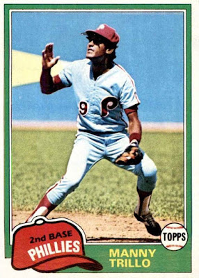
From the Favorites Box: Manny Trillo, 1981 Topps #470

A series where I post some thoughts about favorite cards. Previous cards in the series are available here.
 
 
Who else loves afternoon games?
 
To me, the fresh-cut grass smells better, the crowd feels more lively, the hot dogs taste better. Many would say it's simply baseball as it's meant to be. And I get all of that when I look at the 1981 Topps card of Manny Trillo above.
 
Put yourself in that ballpark and activate all your baseball senses. Fresh-cut grass, hot dogs, sunny afternoon, everything. 
 
Now the batter has just hit a bloop toward short right field, and the crowd is holding its collective breath. Will it fall for a base hit? Will it? 
 
With three-time Gold Glove winner Manny Trillo roaming the area, the likely answer is no. 
 
Just look. He's about to flip down his shades, turn back, and give chase. I think he's got a pretty good bead on it.
 
And why wouldn't he? Trillo had some of his best years around that time. Along with the 1980 World Series championship and three Gold Gloves ('79, '81, and '82), you can add two Silver Slugger awards ('80 and '81) and three All-Star nominations ('81, '82, and '83).
 
As for a best overall season, you might look to 1980. He went .292 at the plate with a career-high 155 hits, 25 doubles, and 219 total bases. In addition, he was the MVP of the NLCS that fall, driving in 4 runs and going 8-for-21 at the plate for a nifty .381 average. 
 
Mr. Trillo's fielding was solid that season too, leading the NL in putouts and finishing second in assists. And if it weren't for Doug Flynn of the Mets snagging the Gold Glove award for NL second basemen, Trillo would have added even more 1980 hardware to his trophy case. (Trillo topped Flynn handily in games played, putouts, assists, and double plays turned that year, but Flynn edged out Trillo in fielding percentage and committed fewer errors.)
 
Regardless, Trillo's Gold Gloves in '79, '81, and '82 were certainly enough to show who the real stud was. 
 
And for wielding that glove like a stud on a classic sunny afternoon at the ballpark, tracking down just about everything hit to you—in a powder blue uniform no less—1981 Topps #470 has a spot in my box of favorite cards.