Sunday, November 24, 2024

More Custom Cards about Nothing

A couple of years ago, I designed a custom card featuring Cosmo Kramer on the 1973 Topps design. Right then and there, I was inspired to do a separate custom card for Jerry Seinfeld on the "Field Leaders/Manager" card design from the same set.
 
I'd run out of time and energy after that, but made a little note to myself about creating more Seinfeld cards using the '73 design at some point in the future—at least a standalone card for the other two members of the fab four (George and Elaine). 
 
Well, it took quite a while to get to it, but I've finally made good on that note. In fact, there aren't just four cards in the set now. There are six!

As a refresher, here are the Kramer and Jerry cards.


If you note the palm trees in the background, you'll gather that Kramer is depicted here in a spring training location. (Quite possibly Del Boca Vista.)


And here's Jerry, as "manager". I figured Newman would be a good 4th member for the "coaches" section of the card. You've got to have an antagonist, right? He'd be like the one coach on the team that no one really liked.

Now here are the new additions to the set.


This image was a natural fit for a baseball card. Not long after the photo was taken, George would step up to the plate, hit a deep drive to the outfield, sprint around the bases, and barrel over opposing catcher Bette Midler to score a big run. (Clean play.)


Elaine gets a headshot, wearing the Orioles cap, of course. She's already in disbelief that someone has asked her to remove it. (Also, note the silhouette above her position of "Little Kicker".)


And that completes the four main character cards. The next thing I wanted to do was include some of the other memorable characters from the show. There are so many good ones—too many for standalone cards. But the 1973 Topps set did contain a bunch of three-player rookie cards, and this provided the perfect solution. Here's my first version: 


It features Uncle Leo (Jerry, hello!), Frank Costanza, and Newman. I did some research, and I don't think Newman's first name was ever revealed on the show. Or maybe Newman is his first name, and we don't know his last name? Regardless, I think the card works better with just "Newman", even with the blank space above it. 


And any Seinfeld set wouldn't be complete without J. Peterman, the Soup Nazi, and David Puddy (high five!) They're absolutely classic characters. I could have also gone with folks like Kenny Bania, Jackie Chiles, crazy Joe Davola, Estelle Costanza, or Helen and Morty Seinfeld, to name a few. Maybe even a trio of Jerry's girlfriends. But I think the six I've chosen are pretty solid.

Now here are all the cards, together.


I'm happy that I was able to showcase characters on the base card, the manager card, and the rookie combination card. There's also the playoffs/World Series card design from the '73 set, and I suppose I could find three "action" shots from certain Seinfeld episodes to make this a 9-card set. I could even stick to baseball-themed images. For example, there's Kramer getting hit with the foul ball at Yankee Stadium, Elaine refusing to take her Orioles cap off during that same game and getting into a scuffle, or even the aforementioned George Costanza knocking over Bette Midler on the softball field. But I don't really think adding three more cards to the set is necessary. It might also be difficult to find a clear image of those events. I don't know. I'll think about it a little more.

For now, I'm happy with the six cards. Hope you're enjoying them, too! If you have a favorite, or would like to see other characters or scenes, let me know in the comment section.

Thanks for reading!

Sunday, November 17, 2024

A Smorgasbord! Kraft Dinners (Hockey)

From the 1970s through the 1990s, it seemed like you could find your favorite baseball stars on food product packaging everywhere you looked: supermarkets, corner stores, restaurants, and beyond. This past year, in an effort to capture a little more nostalgia, I set a goal to expand my own collection of these "food-issue" cards. In this series I'll show the specific examples I've acquired, and share a little bit of history about the food or beverage sponsor as well. 

Previous entries can be found here.
 
 
Picture a November weekend in Canada, circa 1990. It's getting cold outside.

If you're a kid from the nation up north, could anything be more comforting on a cold weekend like this than a bowl of mac & cheese and a hockey game on TV? 
 
Actually, yes. 
 
There's one more thing you can add to that list.


Hockey cards!
 
And you won't even have to go to the local card shop, drug store, or toy store to get them, because you'll find two cards printed on the back panel of every specially marked box of Kraft Dinners, such as this one:


If you go to the supermarket with mom next weekend, you'll see that the cards are also available on specially marked boxes of Kraft Spirals, Kraft Noodles, Kraft Singles, and another tasty product that's now made by Kraft...
 
JELL-O!


But let's get back to the pasta. Here's the back panel of a Kraft Dinner box, showing the cards.


All you have to do is take out your pair of scissors and cut on the dotted line. (But finish your mac & cheese first.)
 
The initial set, released during the 1989-90 season, was 64 cards deep. It consisted mainly of players from the 7 Canadian NHL teams the existed at the time.

For the next season, Kraft expanded the checklist to include the rest of the league, and the set topped out at a whopping 115 cards, including the ones you see above.
 
Here's a shot of the card backs.


The difference in color is a result of the type of cardboard used for the different boxes.  (Modano is from a Kraft Spirals box, while Vanbiesbrouck is from a Kraft Dinner box.)
 
The next season, 1991-92, saw the checklist reduced to 92 cards. But it was still a thorough set. Here are a couple of examples from my collection:


As you can see, the NHL was working hard to promote their 75th anniversary. Not only did they place the official "75" NHL logo on the bottom of each card, but if you look at any player's jersey that season, the logo was there as a shoulder patch, too. On top of that, the original 6 teams (Canadiens, Bruins, Rangers, Black Hawks, Red Wings, and Maple Leafs) wore some pretty cool throwback jerseys on a few special nights during the season to honor the anniversary.
 
Here are the 1991-92 card backs.


The design is a bit neater and cleaner than the 1990-91 set, but I have to say that I kind of miss the illustrated headshots and facsimile signatures. Regardless, With so many Kraft cards on the checklist, you can bet kids across Canada in the early '90s were busy at work cutting them out, trading them, and putting them in binders.

In the sets that followed the 75th anniversary season, Kraft's hockey card totals would fluctuate. It doesn't seem like they ever reached the gaudy numbers from the first few years, but the important point is that Kraft and the NHL would partner up in some way from 1989-90 all the way through 2001-01, consecutively. That's a lot of hockey cards!
 
As for the Kraft company, they go back a long way.
 
In the early 1900s, James L. Kraft and his brother Charles had a cheese delivery business. As you can imagine, transporting cheese without refrigeration and modern preservation techniques was difficult. The product was prone to spoilage.

Out of necessity, the brothers began working on ways to help cheese become more shelf-stable. The result, after much melting, mixing, blending, and experimentation, was a "processed" cheese that was pasteurized and could travel long distances. (And just in time for World War I. A good deal of this cheese was sent overseas to our boys in the service.) Stemming in part from that success, The Kraft company would soon acquire some smaller companies and processes that eventually led to brand names we still know today, such as Velveeta, and Philadelphia cream cheese.

One more note of interest to tie this all together: 
 
During the Great Depression, Kraft rolled out a new product. It was a box that contained dried pasta along with a little packet of processed cheese powder. It was called "Kraft Dinner". There was enough product in each box to serve 4 people, and at a super-affordable price, a whopping 8 million boxes were sold in the first year. The product became even more popular when folks discovered that it helped feed US soldiers overseas during World War II. Pretty amazing result.

Since then, a lot has changed. The Kraft company has gone through numerous mergers and acquisitions, and it's currently known as Kraft Heinz—the 5th largest food company in the world. Yeesh.
 
But Kraft Dinners are still going strong, and the brand's hockey cards that I've got in my collection are a nice way to give a nod to such an iconic product. 
 
Do you think Kraft will ever issue trading cards on their boxes again? Do any of you have Kraft hockey cards, or Kraft baseball cards?

Share in the comment section, and thanks for reading!
Sunday, November 10, 2024

Completed Set: 1982 Topps Football


My earliest memory of opening any kind of collectible pack is from 1983, when my dad brought home a copy of that year's Topps Baseball sticker album and some packs of stickers. Despite that, I do somehow have even earlier memories of the football card design you see above, which is from the previous year, 1982. I don't think I ever opened packs of those cards, but the classic banner and football helmet design is just etched into the deepest parts of my collecting mind. I may have only had a handful of those cards, and I'm not sure where they came from, but I know I had a few.
 
The football helmet design reminds me of something else from that time, too: The rows of coin-operated vending machines you'd often find near the exit of supermarkets or department stores. Because it seems like one of those machines always looked like this:


Mini football helmets! If you were a '70s or '80s kid, do you remember the excitement that came when you put the quarter in that slot, twisted the dial, heard those mechanical sounds that opened the chute, and then lifted the metal flap underneath to reveal which helmet you received?


That little plastic container with a random mini helmet inside was your reward for walking through the big store with mom or dad and helping them run their errands. And man, there was nothing like it. You even got to clip on the face mask and adhere the logos and stripes on the helmet yourself.
 
The finished product was a thing of beauty.


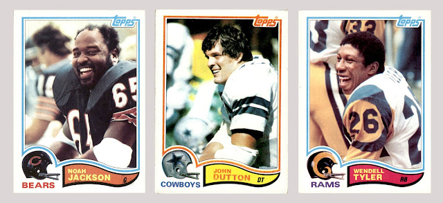
So re-enter 1982 Topps Football and that classic helmet art. You'd also see some classic uniforms. And classic dudes. Gritty, hard-nosed dudes. Just have a look at these three:


What a time to be a little kid watching football.
 
Ultimately, I'll put it this way: 1982 Topps is the first football set I've ever put in a binder. They're the first football cards of any kind—full sets, team sets, or singles—I've put in a binder. It's that nostalgic for me.
 
So let's jump into more.
 
For those of you who love orderliness and organization, you'll love this set. First off, it's arranged by team. Secondly, the teams are arranged in alphabetical order, by city. And on top of that, the players on each team are arranged in alphabetical order, by last name. Clean as a whistle.
 
However, despite all that solid orderliness throughout the set, 1982 Topps is also a set of polar opposites. To explain:
 
Just as with many football sets of the era, it features lots of headshots and photos of guys standing around on the sidelines. And when I say a lot, I mean a lot. Like, all 10 Baltimore Colts cards that start off the set. Here are just a few of them.


It's so pervasive that you won't see a base card that shows genuine game action until card #35, Fred Smerlas of the Buffalo Bills. 


Great photo. It just takes a long time to reach it. And the game-action photos after that follow a similar trend: few and far between.
 
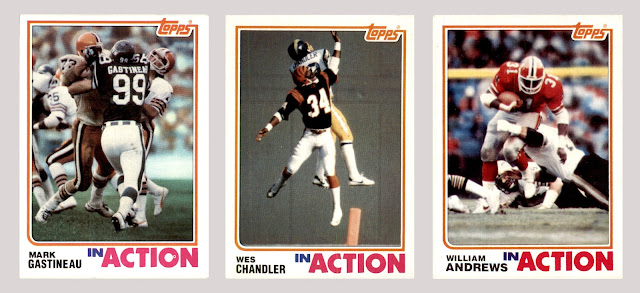
However, before you get too down, here's the polar opposite part of it: The In Action subset
 
Behold these gems.


If you asked a kid in the 1980s to describe the game of football in one play, in one action, it might very well be a running back leaping over the pile at the goal line, like you see in the bottom center card. They might have even mentioned Walter Payton, specifically.
 
And those are just a few of many great-looking examples. The In Action subset is a whopping 66 cards deep, and if you were to put them consecutively in nine-pocket pages, you'd see definitively that Topps was capable of taking amazing photos back then. 
 
So maybe we give the company a little leeway when it comes to all the boring cards in the set.
 
But it's still disappointing that Topps seemed to reserve almost all the action photos for the In Action subset. Flip through the binder and you'll see page after page of static photos. So let's make the best of the situation, and try to find some variation and entertainment within all those boring "players on the sideline" cards.


Some of them were happy.


Some were bummed out


Some were just trying to cool off.


And some were stylin', profilin', or just chillin' out and enjoying the sunny afternoon.
(Looks like Reggie Rucker is about to put on the headphones and listen to some tunes.)


 You also have kickers and punters, of course. 
 
 
Those little one-bar face shields were so dorky.
 
But then there's also this guy:


Barefoot kicker Tony Franklin, in action! And look at the base card on the right to see what the guy actually looks like. You know he brings a lunch pail to the stadium every day that contains a couple of bologna sandwiches with mustard and a thermos of hot instant coffee. Maybe an individually wrapped Ding Dong or Ho Ho for dessert.
 
 
Next, here are a couple of horizontal subsets: League Leaders and Football Brothers.


Both subsets have a fairly simple yet effective designs. I like the big, bold "football brothers" banner, for sure.

On the subject of design, let's look at an example of a card back.


That brownish-yellow color could be a little lighter, which would have made the dark blue text easier to read. But all in all, it's not bad. I like how the football helmet design from the card front continues on the card back (top left). The "team record" section is a nice touch, even if Topps had to turn it sideways to fit.

And now, a fun fact: From 1970 through 1981, Topps did not have the license to use team logos on football cards. But as you can see, in 1982 that finally changed. Collectors must have been absolutely overjoyed to be past all those years of airbrushed helmets. Just look at these next three glorious old-school examples and tell me this set wouldn't have made you way more interested in collecting football cards if you were a kid back then. 


Collectors might have also been excited to get their hands on the very first cards issued of these three big studs and their all-pro status:


(Honorable mention to fellow rookies Cris Collinsworth and Freeman McNeil.)
 

And here are some of the other card types in the set.


Customary for Topps cards of the '80s, the set begins with a few record breakers like the one you see on the left. In the middle, you have an example of a team leaders card. I like how they gave space for two offensive and two defensive categories. (Rushing, receiving, interceptions, and QB sacks.) And on the right, a checklist. Those orange and brown colors feel like holdovers from the 1970s, but it was only 1982 here, so that makes some sense.

Finally, and interestingly, Topps did some promotional work for their other big football product of 1982—the sticker album and stickers. One sticker with a "coming soon" message on the back was inserted in each wax pack of 1982 football cards. Topps chose 16 foil stickers for the special promotion, including some big names like Dan Fouts, Joe Montana, and Lawrence Taylor. I've added those three to my collection, and placed them in a page at the end of the binder. Here's what they look like:


So that's 1982 Topps football. I'm very happy to have completed this set. I think I'll be taking the binder out and flipping through the pages more than I do some other sets I've got in binders.

How about you readers and collectors? What are your thoughts on '82 Topps football? Share in the comment section, and thanks for reading!

Sunday, November 3, 2024

Hockey Sticks


A few months ago I shared some baseball cards from the 1980s and 1990s that clearly showed various bat brands of the era, along with some players who were known to use those brands.

 
Well, the other sport I followed (and played) back then was ice hockey. And hockey players can be just as picky about their sticks as baseball players are with their bats. In fact, hockey players might even have more to consider. Along with the length and weight, there's the shaft flex, the blade curve, the blade height, the blade angle, and the lie angle. And after all that is settled, you've got to decide how to tape the blade. And what sort of tape to use. Some players even apply a little wax on the blade after they've taped it.
 
On top of that, NHL hockey has been an international sport for quite some time now. You can go back as far as the late-1980s and find NHL players from Canada, the USA, Sweden, Finland, Czechoslovakia, Russia, and more. Because of this, players toted sticks from all over the place. And as card collectors, we can see all of those stick brands if we look closely enough.
 
So let's flip through some cardboard, and see what we can find. Similar to the baseball bat post, I'm going to stay with the era of hockey I'm most familiar with. Let's call it 1975 through 1995. That matches up well to the hockey cards I have in my collection, too.
 
(Note: Because hockey sticks usually don't show up at close range on trading cards, you might have to zoom in on some of the images a little bit to see the brand names.)
 
Here we go. 


1982-83 Neilson #11 Wayne Gretzky, 19998 Kenner Starting Lineup Timeless Legends #555040 Mike Bossy,
1986-87 Topps Box Bottoms #I Mario Lemieux 

The Finnish brand Titan had eye-catching graphics, often red and white, and also came in a "Turbo" model. The sticks were made outrageously popular by two of the most prolific goal scorers of the 1980s: Wayne Gretzky and Mike Bossy. It's pretty remarkable that Titan also had a young Mario Lemieux in their stable for a little while.


1981-82 O-Pee-Chee #111 Paul Coffey, 1979-80 O-Pee-Chee #200 Guy Lafleur, 1990-91 Topps #5 Jari Kurri

Koho, another Finnish brand, manufactured sticks that were pretty popular back then as well. The thin red stripes and blocky "KOHO" wordmark made these sticks easy to notice. Other big scorers of the '80s to use Koho sticks include Mario Lemieux, who switched from the Titan brand, and Pat LaFontaine early in his career.


1988-89 Topps #13 Marcel Dionne, 1994-95 Stadium Club #77 Ray Bourque, 1993-94 Ultra #246 Tomas Sandstrom
 
Sherwood was a solid hockey stick manufacturer out of Canada for many years, and the "P.M.P." models were used by many NHL players throughout the '80s and '90s. I used Sherwoods quite a bit during my high school hockey days. Although the sticks were mostly available in the black, white, or natural wood color, I think Tomas Sandstrom used that red-colored version (see right-hand card) throughout his NHL career, no matter what team he played for.


1992-93 Pinnacle #209 Neal Broten, 1992-93 Stadium Club #216 Dave Christian, 1991-92 Upper Deck #20 Jaromir Jagr
 
The Christian Brothers Hockey Company was founded by American hockey royalty. Bill Christian and his brother Roger were members of the 1960 US Olympic hockey team that took home the gold medal. Bill's son Dave (pictured above, middle) was a member of the 1980 US Miracle on Ice hockey team, which also of course took home the gold. On top of that, Bill and Roger had another brother, Gordon, who helped the 1956 US Olympic team take home a silver medal. And to bring it back to the present, Brock Nelson, currently a center for the New York Islanders, is Dave Christian's nephew!
 
All that being said, it's no surprise that the family knew a thing or two about hockey sticks when they started manufacturing them in the early 1960s. It's also no surprise that Dave Christian and his Olympic teammate Neal Broten used these sticks, along with some other notable pros like Jaromir Jagr. That diamond-pattern wrap on the blade is how you know it's a Christian.


1974-75 Topps Billy Harris #228, 1975-76 O-Pee-Chee #246 Bobby Lalonde, 1976-77 O-Pee-Chee #91 Marcel Dionne

CCM sticks were popular in the 1970s, but by the time the 1980s rolled around, I feel like the company was much better known for its helmets, pads, and hockey jerseys. The sticks did experience a resurgence in the late-1990s, however, and they've made another comeback here in modern times. Superstar players like Autson Matthews, Sidney Crosby, and Connor McDavid use CCM sticks.


1982-83 O-Pee-Chee #77 Doug Wilson, 1986-87 O-Pee-Chee #173 Al MacInnis, 1988-89 Topps #58 Cam Neely

You can easily notice Canadien sticks on hockey cards by that super-cool 1980s font. I don't remember them being that prevalent, though—among the pros or in local hockey shops.


1990-91 Kraft #23 Pt LaFontaine, 1992-93 Parkhurst #218 Alexander Mogilny, 1990-91 Pro Set #257 Joe Sakic

Louisville hockey sticks—a brand owned by the very same Louisville Slugger/Hillerich & Bradsby company—were around as far back as the 1970s. However, it wasn't until the 1990s that the "TPS" model (Tournament Players Series) brought the brand into the spotlight. Many big stars of the day used the TPS, as you can see from the three cards above. You'll also see from the photos that Louisville's hockey gloves were quite popular. I wore Louisville gloves for most of my high school and college hockey days.


1975-76 O-Pee-Chee #170 Greg Joly, 1987-88 Islanders Police NNO Bryan Trottier, 1990-91 Bowman Hat Tricks #20 Bernie Nicholls

Although the Victoriaville company wasn't really one of the major brands of the time, I remember their sticks being in hockey shops all around Long Island when I was a kid. I feel like quite a few Islanders players used Vic hockey sticks back then, so there must have been something to them.


1991-92 Parkhurst #207 Wayne Gretzky, 1991-92 Bowman #125 Mike Modano, 1991-92 Parkurst #219 Brett Hull

Yep, this is the same Easton that made those ultra-popular aluminum baseball bats in the 1990s. The superstars you see on the hockey cards above really sold the company's new, fancy aluminum shafts. (Wooden blade not included.) Brett Hull scored a million goals a year with Eastons back then. And the company made an especially shiny silver model for Wayne Gretzky during his days with the Kings. I remember those "Easton Air" hockey gloves you see on the cards above being wildly popular at the time, too.


1992-93 Pinnacle #8 Nicklans Lidstrom, 1983-84 O-Pee-Chee Mats Naslund, 1990-91 Score #224 Sergio Momesso

Montreal, Torspo, and Chimo were three other stick brands I remember back then. However, I just don't think they were used by a whole lot of NHL players. Torspo was a Scandinavian brand, and funny enough, I think Montreal was, too. Chimo sticks were made by Sherwood.
 
 
And I think that covers the hockey stick brands of the era. I know there aren't as many hockey fans around the trading card blogosphere as there are baseball fans, but I'll still pose the questions:

Do you remember any of these stick brands from back then? What brand did your favorite players use? And if you played hockey, what brands did you use?

Thanks for reading!