
A couple of months ago, I posted a preliminary redesign of what was originally a very yellow 1991 Fleer baseball card set. I say preliminary because by the end of that post I just couldn't decide which of two border color ideas I liked better: white or charcoal. So, I asked you, the readers, to contribute your thoughts.
The comments were just about even between white and charcoal, so instead of choosing one border color or the other for the complete redesign, I figured I'd do both for each team. Bonus cards!
Just as with the 1992 Fleer redesign I did a while back, I tried to choose a card for each team that featured a well-framed shot, a good action shot, or otherwise interesting subject matter. As you'll see, I think the Fleer photographers captured some gems that season.
First, here's a reminder of what the original cards look like. Jack Clark is wondering why so much yellow.

Now here's the redesign for each team, in alphabetical order by city name.

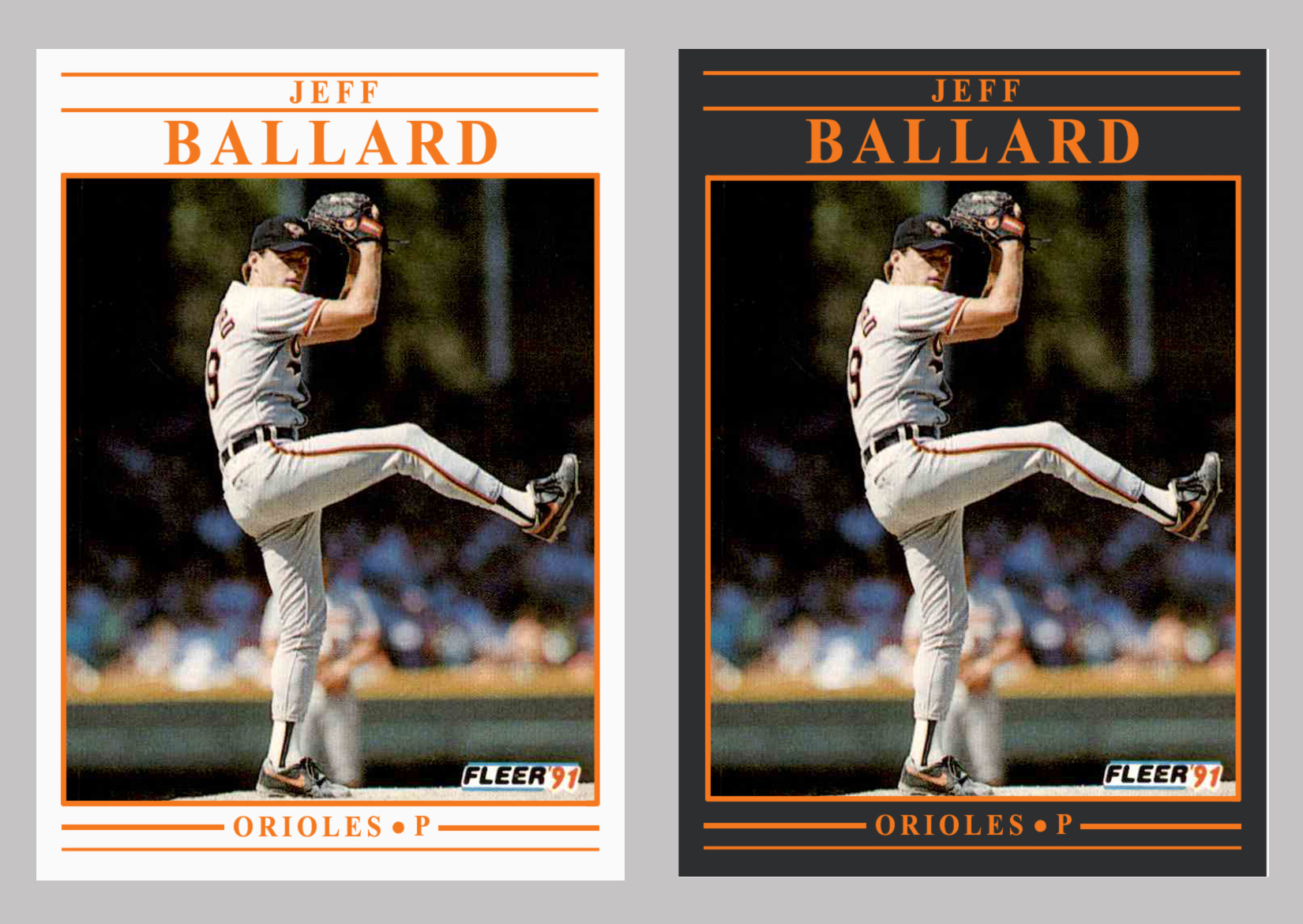


I think I like some of the teams better in white (Brewers, Yankees, Phillies) and other teams in charcoal (Orioles, Athletics, Pirates). And then there are some teams that look fine either way (Pirates, Cardinals, Blue Jays). Ultimately, I enjoyed the project, and I hope you like the way the cards turned out.
Any favorites of the bunch? Did I do your team justice with the color and image choice?
Share in the comment section, and thanks for reading.
It's interesting that the charcoal gray looks a little different to the eye depending on what color it's paired with. It's a common optical illusion, but I kind of like how it works here.
ReplyDeleteFor my Mets orange I think the grey looks better than the white, while for some other teams I think the white is nicer. I think I like the Phillies having a different color in the gray than in the black.
Thanks for the elaborate comments, Brett! I like how the Phillies cards turned out, too.
DeleteI don't normally comment on these (but read most of them). I had to jump in on this one. Overall, if asked, which border for the whole set, I would go with the whits borders and the team color text and framing. There are a few teams (more like color combos) that work for me in the charcoal border (looking back, it's pretty much only blue text), but not all of them work. As for what you did for the charcoal Phillies text/framing with the silver font, that's a color combo that could work for the entire set. Great stuff, as usual. Question - what would you do with the backs of these 1991 Fleer cards? :)
ReplyDeleteOh boy. I haven't even thought of the card backs! I suppose I'd replace the yellow there, as well. Not sure about the rest. Might be a future project.
DeleteGood to see your comment, Dan. Glad a Phillies fan likes the Phillies cards. The silver-gray color works especially well with players who are wearing road grays.
I do like the new designs you corrected. I am like most collectors in not liking the original 1991 Fleer cards, but the early 1990s cards are some of the first cards I ever bought witb my own money earned from doing chores and helping my grandma.
ReplyDeleteThose memories are what collecting cards is all about, OhioTim! Thanks for sharing. Glad you enjoyed the redesign.
DeleteI'm one of those collectors who don't mind the yellow borders... but I think you did a great job with both of my teams with the charcoal borders. That being said... I do like seeing "blue" teams with the white borders (ex. Yankees).
ReplyDeleteThanks very much, Fuji! The Tony Gwynn card is pretty cool. Do you think the umpire called that pitch a ball or a strike?
DeleteI think the white borders are my favorite, though the black borders work well for some teams like my Yankees.
ReplyDeleteThanks for the comment, GTT! I think both Yankees designs are pretty sharp.
DeleteAnother Yankee fan voting for the black borders. I actually like them better in general. Particularly the red on black, I really like that combo.
ReplyDeleteThanks very much, Bo! I think it would have been fun to open packs of these cards back then.
DeleteI'm in agreement with most everyone here. Some teams look great in black, others in white.
ReplyDeleteClearly what they should have done was the same thing we saw in 1991 Score. Don't use just one.
That's what I'm thinking too, Adam. But I guess there would have been a whole lot of "copycat" discussion around the card industry if Fleer had gone with both the black and white border options.
DeleteReally like the white with the team color text.
ReplyDeleteThanks Jeff! I like the white borders, too. There's something to be said for simplicity and sharpness, isn't there?
DeleteI'm probably one of the few '91 Fleer fans out there (yellow borders and all!) but I really like these mock-ups as well. Think I'd have to give a slight edge to the black-border design since black borders receive such little airplay these days.
ReplyDeleteThanks very much, Nick! The only issue I can think of with the charcoal borders is that if they were actual cards, the edges would probably experience the typical "chipping" that dark-colored cards often experience. Maybe that's an advantage to concept cards. Hah.
Delete